library(ggmap)
library(tidyverse)

san.diego.crime.2012 <- read_rds('data/san_diego_crime_2012.rds')

# extract data for coordinates on map
ucsd.crime <- san.diego.crime.2012 %>%
  filter(-117.26 <= lon & lon <= -117.20,
         32.85 <= lat & lat <= 32.91)

# quick plot
qmplot(x=lon, y=lat, data = ucsd.crime)Data Visualization in R: Making Maps
Some data has a geographical dimension. We need tools for mapping data like this. In this section we will use using the ggmap package for mapping.
ggmap is basically an extension of ggplot2 and allows you to download open sourced map objects, e.g., Google Maps or Open Street Maps. To use this library you need to be online since it relies on a API calls when you initialize a new map.
Putting data on a map requires very little effort. Let’s try to plot crimes on and around UCDS’s campus:
library(ggmap)Loading required package: ggplot2Warning: package 'ggplot2' was built under R version 4.1.3Google's Terms of Service: https://cloud.google.com/maps-platform/terms/.Please cite ggmap if you use it! See citation("ggmap") for details.library(tidyverse)Warning: package 'tidyverse' was built under R version 4.1.3Warning: package 'tibble' was built under R version 4.1.3Warning: package 'stringr' was built under R version 4.1.3Warning: package 'forcats' was built under R version 4.1.3-- Attaching core tidyverse packages ------------------------ tidyverse 2.0.0 --
v dplyr 1.1.1.9000 v readr 2.0.2
v forcats 1.0.0 v stringr 1.5.0
v lubridate 1.8.0 v tibble 3.2.1
v purrr 0.3.4 v tidyr 1.1.4 -- Conflicts ------------------------------------------ tidyverse_conflicts() --
x dplyr::filter() masks stats::filter()
x dplyr::lag() masks stats::lag()
i Use the conflicted package (<http://conflicted.r-lib.org/>) to force all conflicts to become errorssan.diego.crime.2012 <- read_rds('../modules/Visualization/data/san_diego_crime_2012.rds')
# extract data for coordinates on map
ucsd.crime <- san.diego.crime.2012 %>%
filter(-117.26 <= lon & lon <= -117.20,
32.85 <= lat & lat <= 32.91)
# quick plot
qmplot(x=lon, y=lat, data = ucsd.crime)Using zoom = 14...
Source : http://tile.stamen.com/terrain/14/2855/6604.png
Source : http://tile.stamen.com/terrain/14/2856/6604.png
Source : http://tile.stamen.com/terrain/14/2857/6604.png
Source : http://tile.stamen.com/terrain/14/2858/6604.png
Source : http://tile.stamen.com/terrain/14/2855/6605.png
Source : http://tile.stamen.com/terrain/14/2856/6605.png
Source : http://tile.stamen.com/terrain/14/2857/6605.png
Source : http://tile.stamen.com/terrain/14/2858/6605.png
Source : http://tile.stamen.com/terrain/14/2855/6606.png
Source : http://tile.stamen.com/terrain/14/2856/6606.png
Source : http://tile.stamen.com/terrain/14/2857/6606.png
Source : http://tile.stamen.com/terrain/14/2858/6606.png
Source : http://tile.stamen.com/terrain/14/2855/6607.png
Source : http://tile.stamen.com/terrain/14/2856/6607.png
Source : http://tile.stamen.com/terrain/14/2857/6607.png
Source : http://tile.stamen.com/terrain/14/2858/6607.png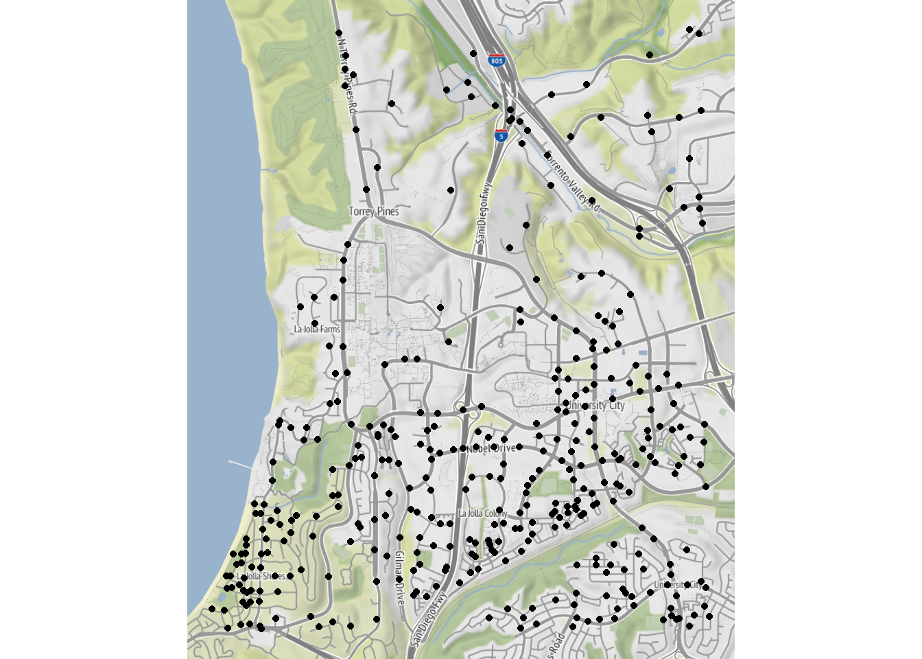
Nice - but what are these crimes? You can indicate this by coloring the points:
qmplot(x=lon, y=lat, data = ucsd.crime,color=type,size=I(3),alpha=I(.7))Using zoom = 14...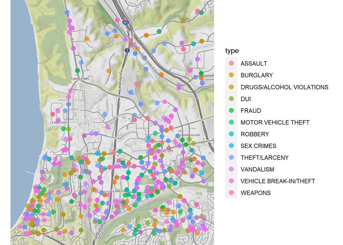
One of the big advantages of the ggmap package is that it gives you the power of Google Maps at your hands - including geolocation. The only downside is that this feature requires a Google Cloud API key:
myKey <- 'USE YOUR API KEY'
register_google(key = myKey, account_type = "premium", day_limit = 100000)

# Note: you also need to enable the Static Map and the Geocode API in your google cloud dashboard

ucsd.map <- get_map("UC San Diego", color="bw",zoom=14)
ggmap(ucsd.map)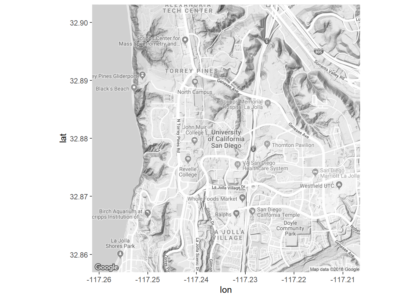
Now we can add points to the map:
ggmap(ucsd.map) +
  geom_point(data=ucsd.crime,
             aes(x=lon,y=lat,color=type),
             size=4,alpha=.7)
Warning: Removed 505 rows containing missing values (`geom_point()`).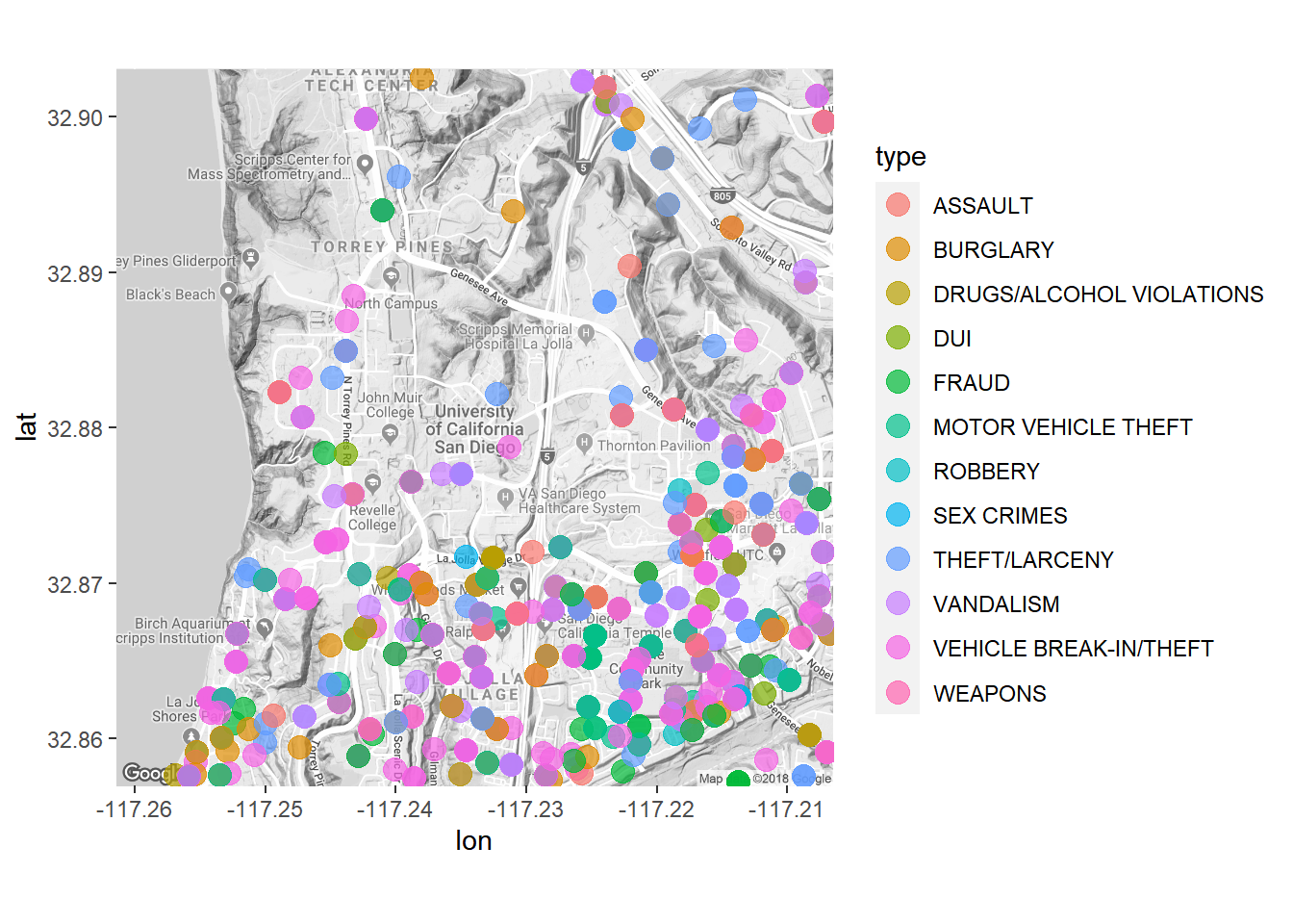
How about the whole city of San Diego? Let’s download a new map (for the whole city), and then concentrate on the most prevalent types of crime:
san.diego.map <- get_map("San Diego",zoom=11,color='bw')

san.diego.crime.sub <- san.diego.crime.2012 %>%
  filter(type %in% c('BURGLARY','ASSAULT','THEFT/LARCENY',
                     'DRUGS/ALCOHOL VIOLATIONS','MOTOR VEHICLE THEFT','DUI'))


ggmap(san.diego.map) +
  geom_point(data=san.diego.crime.sub,aes(x=lon,y=lat,color=type),size=.15,alpha=.3) +
  facet_wrap(~type) +
  theme(legend.position="none")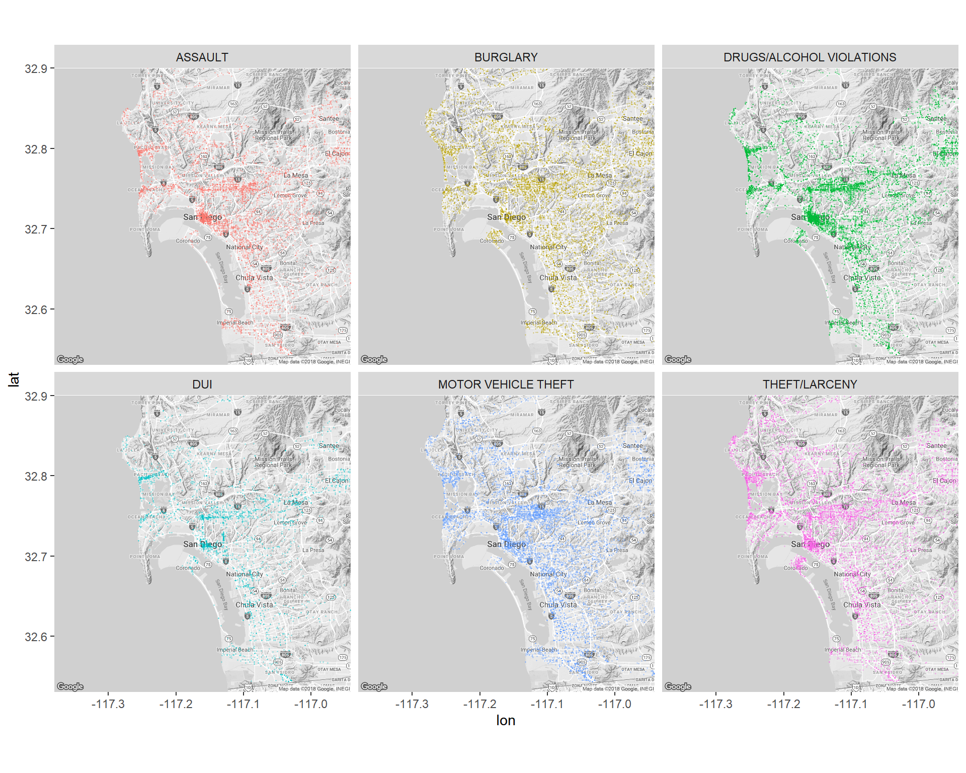
Mapping the Citibike Data
We can start by mapping the bike stations in the system. First, load the data, then extract latitude and longitude for each station (along with number of trips originating from the station). Then plot station locations:
citibike <- read_rds('data/201508.rds')

## get station info
station.info <- citibike %>%
  group_by(start.station.id) %>%
  summarise(lat=as.numeric(start.station.latitude[1]),
            long=as.numeric(start.station.longitude[1]),
            name=start.station.name[1],
            n.trips=n())


## get map and plot station locations
newyork.map <- get_map(location= 'Lower Manhattan, New York',
                       maptype='roadmap', color='bw',source='google',zoom=13)

ggmap(newyork.map) +
  geom_point(data=station.info, aes(x=long,y=lat), color='red',size=2)+
  theme(axis.ticks = element_blank(), axis.text = element_blank())+
  xlab('')+ylab('')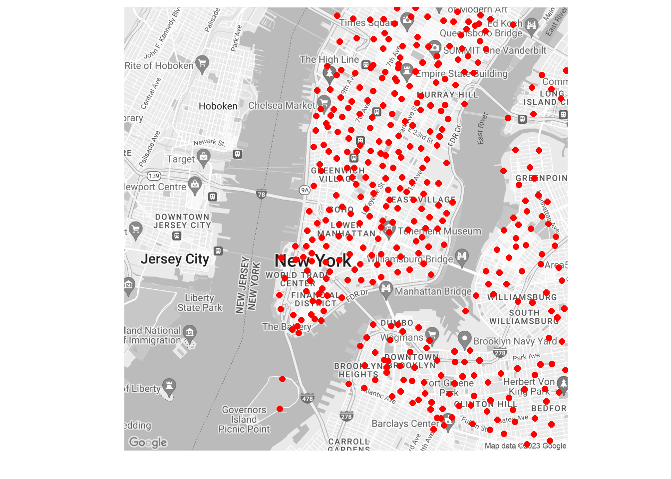
Ok - now add information on station activity:
 ggmap(newyork.map) +
  geom_point(data=station.info,aes(x=long,y=lat,color=n.trips),size=3,alpha=0.75)+
  scale_colour_gradient(high="red",low='green')+
  theme(axis.ticks = element_blank(),axis.text = element_blank())+
  xlab('')+ylab('')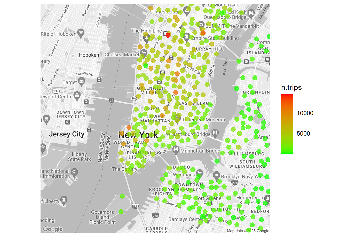
Let’s finish this section with a slightly more complicated analysis: Take the busiest station in the system (in terms of starting trips). Then visualize to where the most frequently occurring trips are.
We need to first find the busiest station:
top.station <- citibike %>%
  group_by(start.station.id) %>%
  summarise(n.trips=n(),
            name=start.station.name[1],
            lat=start.station.latitude[1],
            lon=start.station.longitude[1]) %>%
  arrange(desc(n.trips)) %>%
  slice(1)

top.station
# A tibble: 1 x 5
start.station.id n.trips name lat lon
<int> <int> <chr> <dbl> <dbl>
1 521 14498 8 Ave & W 31 St 40.8 -74.0So the most active station is station 521. Now extract trips originating here and find the top 20 trips:
busy.station.out <- citibike %>%
  filter(start.station.id==521) %>%
  group_by(end.station.id) %>%
  summarise(n.trips=n(),
            name=end.station.name[1],
            start.lat = as.numeric(start.station.latitude[1]),
            start.lon = as.numeric(start.station.longitude[1]),
            end.lat = as.numeric(end.station.latitude[1]),
            end.lon = as.numeric(end.station.longitude[1])) %>%
  arrange(desc(n.trips)) %>%
  slice(1:20)
Now plot the extracted routes:
map521 <- get_map(location = c(lon = top.station$lon,
                               lat = top.station$lat), color='bw',source='google',zoom=14)


ggmap(map521) +
  geom_segment(data=busy.station.out,aes(x=start.lon,y=start.lat,
                   xend=end.lon,yend=end.lat,
                   color=n.trips),
               size=1,alpha=0.75) +
  geom_point(data=busy.station.out,aes(x=end.lon,y=end.lat,color=n.trips), size=3,alpha=0.75) +
  geom_point(data=top.station, aes(x=lon,y=lat), size=4, alpha=0.5) +
  scale_colour_gradient(high="red",low='green') +
  theme(axis.ticks = element_blank(),
        axis.text = element_blank()) +
  xlab('')+ylab('') +
  ggtitle(paste0('Top 20 Trips starting at ', top.station$name))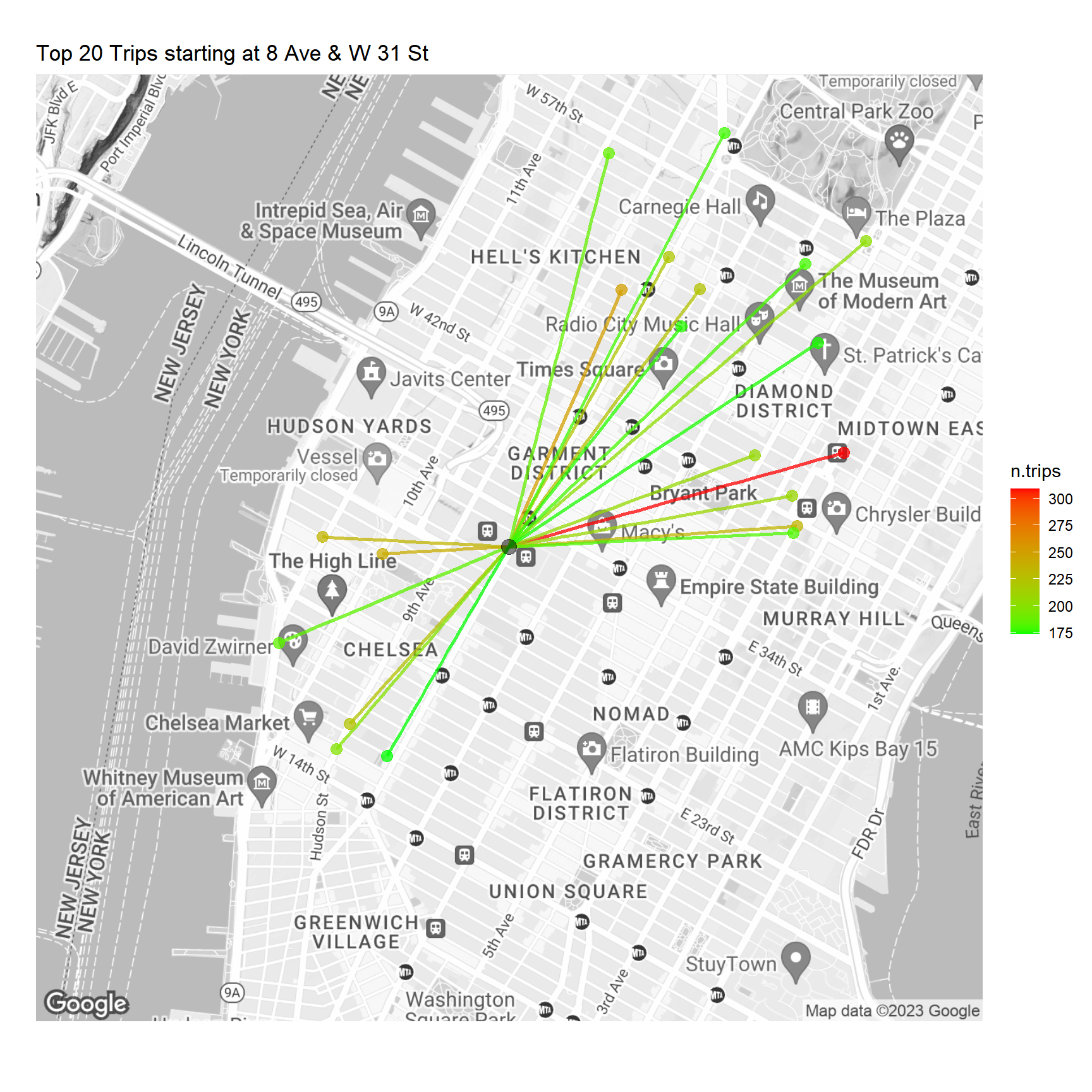
Mapping the Taxi Data
 There are many aspects of the Taxi data that could be interesting to map. Here we will focus on two smaller case studies.
Who goes to the Metropolitan Museum of Art?
Located on the Upper East Side of Manhattan, and one of the prime museum attractions in New Work, this massive art museum draws large crowds every day. Let’s focus on visitors who take a taxi to the museum. What can we say about these visitors?
First we need to decide on what trips might be trips to the museum. This is not obvious - people can get off a cab near the museum but not actually go to the museum. We will ignore difficulties like this in the following. Let’s start by getting a map of the city block where the museum is located:
ny.map <- get_map("1015 5th Ave, New York, NY", color="bw",zoom=18)
ggmap(ny.map)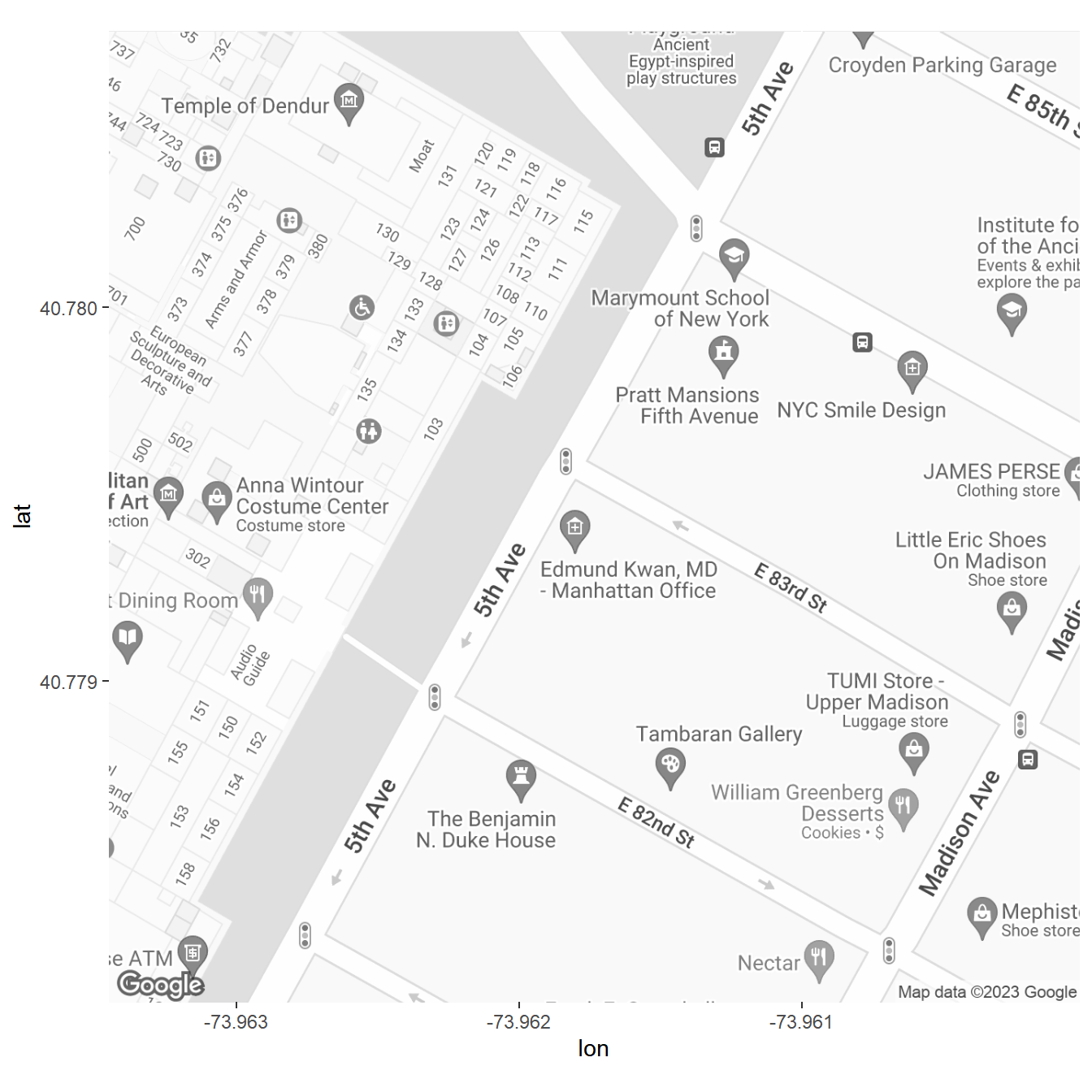
Using the latitude and longitude information the map, we can grab trips that end near the museum entry:
library(lubridate)
library(forcats)
## Pick coordinates that approximates dropoffs near the Met
lat <- c(40.7785,40.780)
lon <- c(-73.963,-73.9615)

taxi <- read_csv('data/yellow_tripdata_2015-06.csv') %>%
  mutate(weekday.pickup = wday(tpep_pickup_datetime,label=TRUE,abbr=TRUE),
         weekday.dropoff = wday(tpep_dropoff_datetime,label=TRUE,abbr=TRUE),
         hour.trip.start = factor(hour(tpep_pickup_datetime)),                                 # hour of day
         hour.trip.end = factor(hour(tpep_dropoff_datetime)),                                  # hour of day
         day = factor(mday(tpep_dropoff_datetime)),                                             # day of month
         trip.duration = as.numeric(difftime(tpep_dropoff_datetime,tpep_pickup_datetime,units="mins")),   # trip duration in minutes
         trip.speed = ifelse(trip.duration > 1, trip_distance/(trip.duration/60), NA),          # trip speed in miles/hour
         payment_type_label = fct_recode(factor(payment_type),
                                         "Credit Card"="1",
                                         "Cash"="2",
                                         "No Charge"="3",
                                         "Other"="4")) %>%
  filter(day %in% c(1:28))


## Filter data for drop-offs near the Met
taxi.drop.met <- taxi %>%
  filter(dropoff_longitude > lon[1] & dropoff_longitude < lon[2],
         dropoff_latitude > lat[1] & dropoff_latitude < lat[2])

ggmap(ny.map) +
  geom_point(data=taxi.drop.met,
             aes(x=dropoff_longitude,y=dropoff_latitude),size=.03,alpha=0.3,color="red")+
  ggtitle('Taxi Dropoffs near the Met')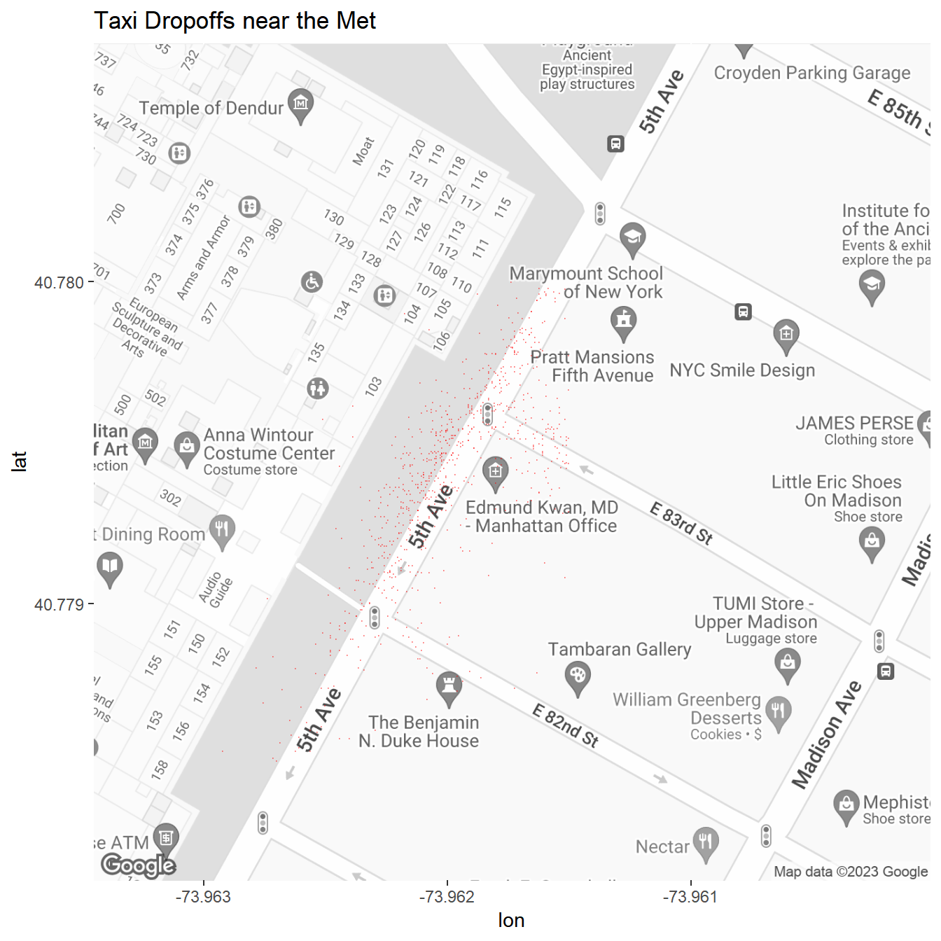
Let’s assume that these represent trips to the Met. Where did they originate? We can answer that by plotting the origin latitude and longitude. We need a new map to capture a wider area - here we center it around Central Park:
ny.map <- get_map("Central Park, New York, NY", color="bw",zoom=13)

ggmap(ny.map) +
  geom_point(data=taxi.drop.met,
             aes(x=pickup_longitude,y=pickup_latitude),size=.03,alpha=0.3,color="blue")+
  geom_point(data=taxi.drop.met,
             aes(x=dropoff_longitude,y=dropoff_latitude),size=.03,alpha=0.3,color="red")+
   theme(axis.ticks = element_blank(),
        axis.text = element_blank())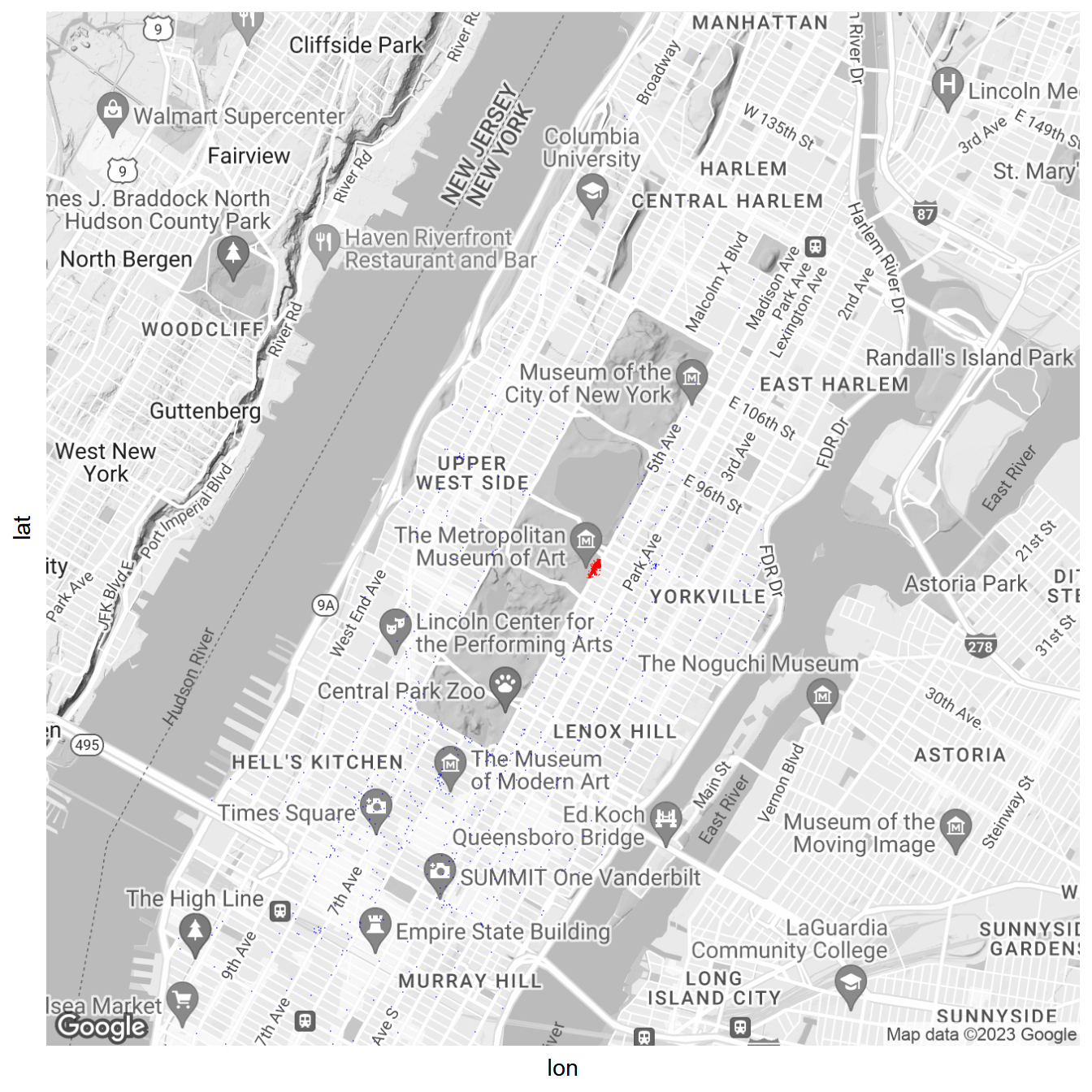
The majority of trips ending with a dropoff near the Met originate on the Upper East and West side and the Midtown neighborhood. Very few trips originate in the lower part of Manhattan and from Harlem.
What time do these trips end?
taxi.drop.met %>%
  group_by(hour.trip.end) %>%
  summarize(n=n()) %>%
  ggplot(aes(x=hour.trip.end,y=n)) + geom_point() +
  geom_line(aes(group=1),linetype='dotted')+
  ylab('Trips')+xlab('Hour of Day')+
  ggtitle('Taxi Arrivals near the Met by Time of Day')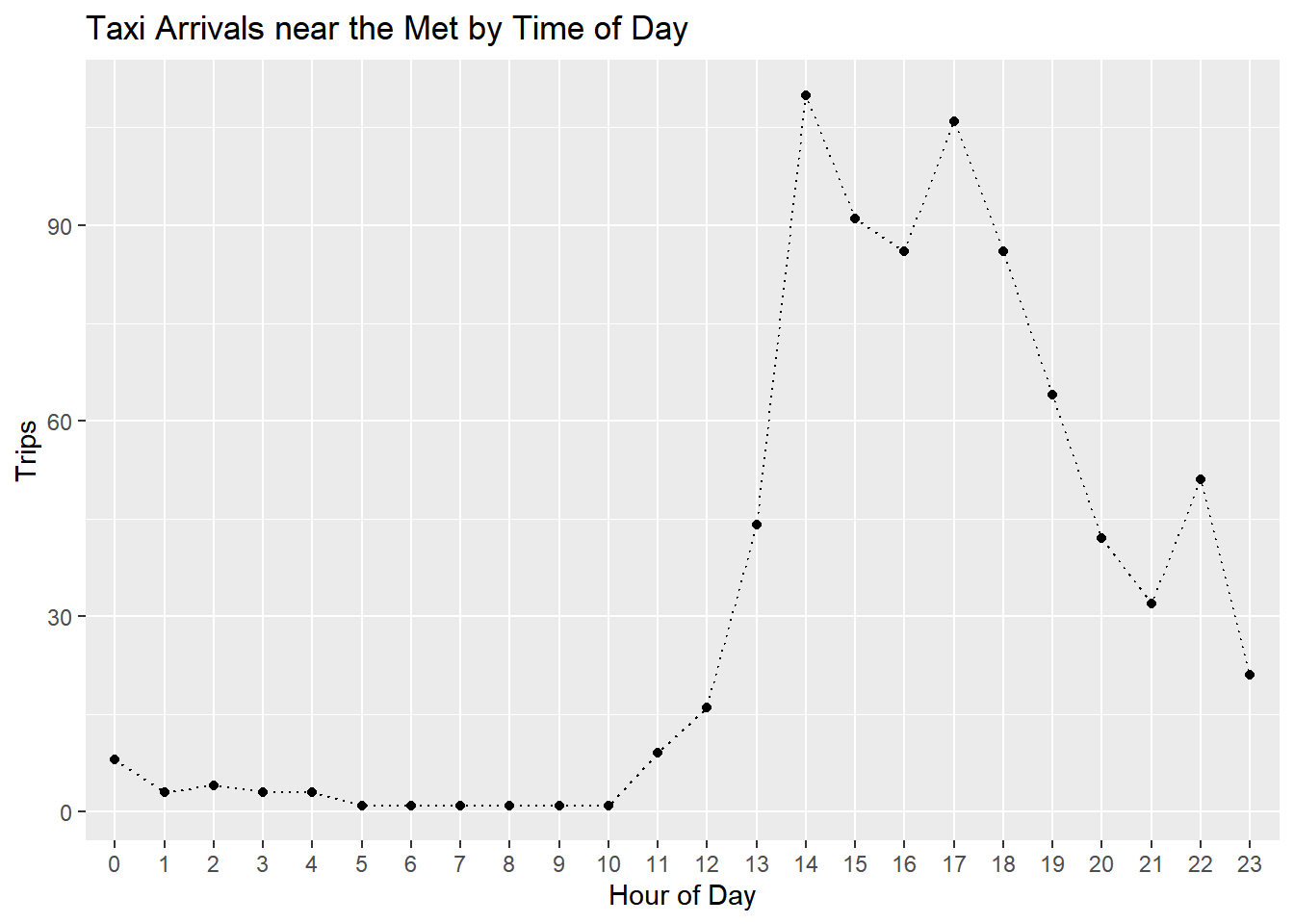
What time do you think the Met opens……?
How are trips distributed throughout weekdays?
taxi.drop.met %>%
  ggplot(aes(x=weekday.dropoff)) +
  geom_bar() + xlab('Day of Week') + ylab('Trips') +
  ggtitle('Taxi Arrivals near the Met by Weekday')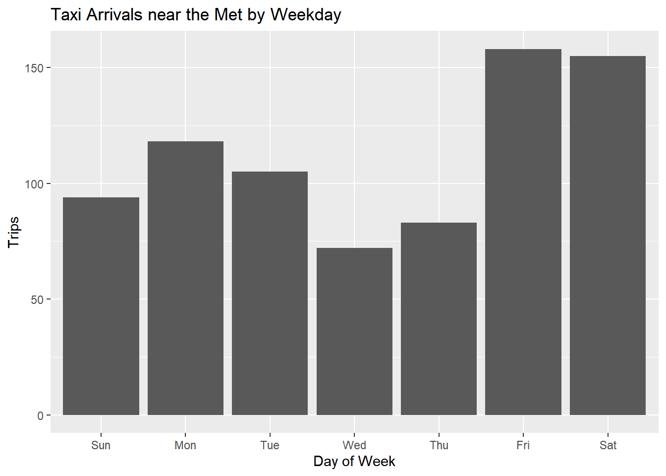
How do people pay?
library(scales)Warning: package 'scales' was built under R version 4.1.3
Attaching package: 'scales'The following object is masked from 'package:purrr':
discardThe following object is masked from 'package:readr':
col_factortaxi.drop.met %>%
filter(payment_type_label %in% c('Credit Card','Cash')) %>%
ggplot(aes(x=payment_type_label)) +
geom_bar(aes(y=..count../sum(..count..),fill=payment_type_label)) +
scale_y_continuous(labels=percent)+
theme(legend.position="none")+
xlab('Passenger Count')+ylab('Percent of Trips')+
ggtitle('Payment for Taxi Trips to the Met')Warning: The dot-dot notation (`..count..`) was deprecated in ggplot2 3.4.0.
i Please use `after_stat(count)` instead.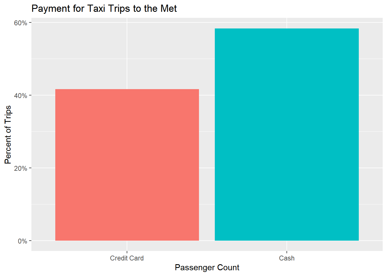
Is type of payment correlated with origin of trip?
ggmap(ny.map) +
  geom_point(data=filter(taxi.drop.met,payment_type_label %in% c('Credit Card','Cash')),
             aes(x=pickup_longitude,y=pickup_latitude,color=payment_type_label),size=.10,alpha=0.5) +
  facet_wrap(~payment_type_label)+
  theme(axis.ticks = element_blank(),
        axis.text = element_blank(),
        legend.position="none")
It seems like Cash trips have a relatively higher likelihood of originating in the Midtown district.
Finally, how do people tip?
taxi.drop.met %>%
  filter(payment_type_label=='Credit Card') %>%
  mutate(tip.pct=tip_amount/(total_amount-tip_amount)) %>%
  filter(tip.pct < 0.40) %>%
  ggplot(aes(x=tip.pct)) + geom_density(fill='red',alpha=0.4) +
  scale_x_continuous(labels=percent)+xlab('Tip Size')+
  ggtitle('Tips for Taxi Trips to the Met')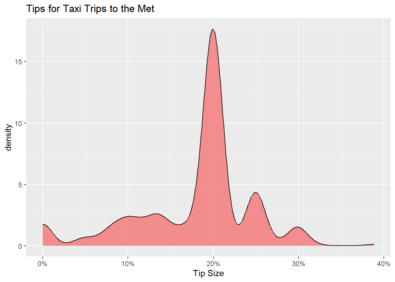
12 Hours in the Meatpacking District
In the early 20th century, the meatpacking district in Manhattan was home to a large number of slaughterhouses and meat packing plants. In the early 21st century, it is instead home to a large number of bars and restaurants. It is a very popular destination for going out in Manhattan. But when and where do people go out?
Let’s diagnose the taxi traffic patterns over the 12 hour period from Thursday 6pm to Friday 5am. Are their particular spots where riders are dropped off and picked up? And how does this activity change over the 12 hour period? A neat way to visualize this is to combine the “small multiples” approach (using ggplot’s facet_wrap option) with a heatmap of activity. This heatmap will “smooth out” neighboring points on the map. Clusters with high activity (i.e., many dropoffs (or pickups)) will be “hotter” (here more red).
We start by grabbing a map centered on the meatpacking district. We choose a high level of zoom:
ny.map <- get_map("Meatpacking District, New York, NY", color="bw",zoom=17)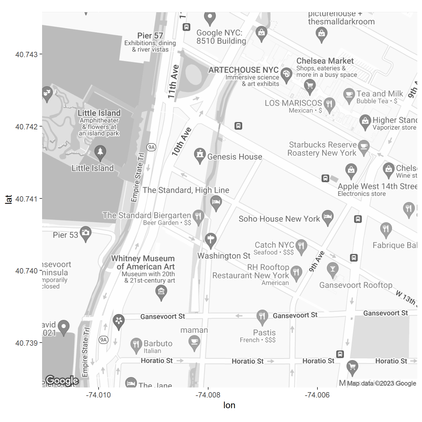
Next we pick the required slice of time and add some nice labels:
weekday.time.segment <- c('Thurs 18','Thurs 19','Thurs 20','Thurs 21','Thurs 22','Thurs 23','Fri 0','Fri 1','Fri 2','Fri 3','Fri 4','Fri 5')
weekday.time.segment.labels <- c('Thu 6PM','Thu 7PM','Thu 8PM','Thu 9PM','Thu 10PM','Thu 11PM','Fri 12AM','Fri 1AM','Fri 2AM','Fri 3AM','Fri 4AM','Fri 5AM')


plot.df <- taxi %>%
  unite(weekday.drop.time, weekday.dropoff,hour.trip.end,sep=" ") %>%
  filter(weekday.drop.time %in% weekday.time.segment) %>%
  mutate(weekday.drop.time = factor(weekday.drop.time,
                                    levels=weekday.time.segment,
                                    labels=weekday.time.segment.labels))
Finally, we plot the heatmaps:
ggmap(ny.map)+
  stat_density2d(data = plot.df,
                 aes(x = dropoff_longitude, y = dropoff_latitude,fill = ..level.., alpha = ..level..),
                 geom = "polygon") +
  scale_fill_gradient(low = "green", high = "red") +
  scale_alpha(range = c(0, 0.75), guide = FALSE) +
  ggtitle('Meatpacking District Taxi Ride Dropoffs')+
  facet_wrap(~weekday.drop.time,nrow = 3)+
  theme(axis.ticks = element_blank(),
        axis.text = element_blank(),
        legend.position="none")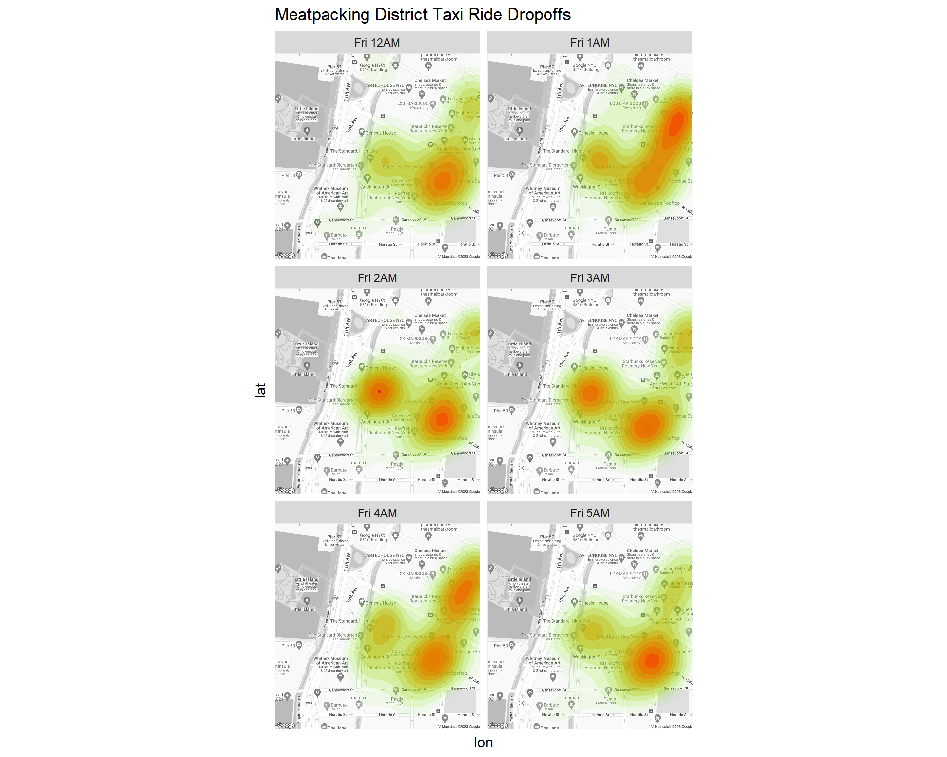
Let’s repeat this exercise for pick-ups:
plot.df <- taxi %>%
  unite(weekday.pickup.time, weekday.dropoff,hour.trip.start,sep=" ") %>%
  filter(weekday.pickup.time %in% weekday.time.segment) %>%
  mutate(weekday.pickup.time = factor(weekday.pickup.time,
                                    levels=weekday.time.segment,
                                    labels=weekday.time.segment.labels))

ggmap(ny.map)+
  stat_density2d(data = plot.df,
                 aes(x = pickup_longitude, y = pickup_latitude,fill = ..level.., alpha = ..level..),
                 geom = "polygon") +
  scale_fill_gradient(low = "green", high = "red") +
  scale_alpha(range = c(0, 0.75), guide = FALSE) +
  ggtitle('Meatpacking District Taxi Ride Pick-ups, June 2015')+
  facet_wrap(~weekday.pickup.time,nrow = 3)+
  theme(axis.ticks = element_blank(),
        axis.text = element_blank(),
        legend.position="none")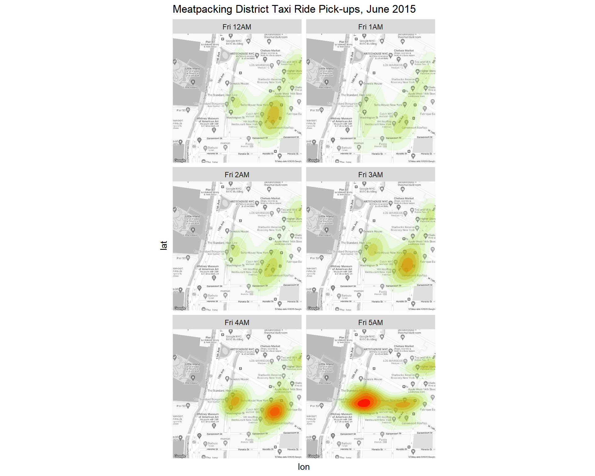
Making Maps with ggplot2
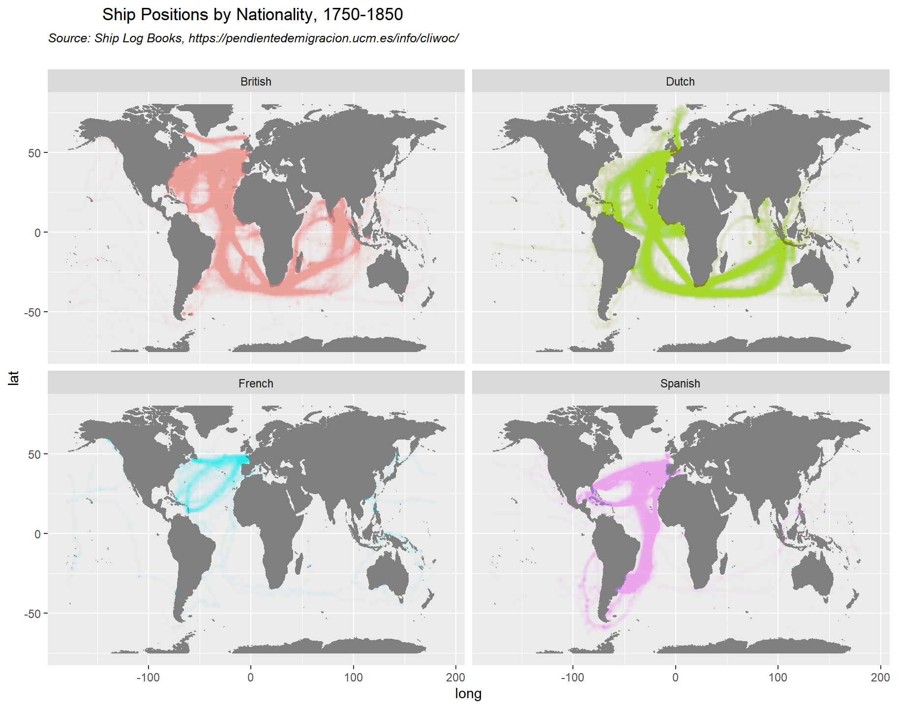
We have been using the ggmap package for maps. You can also make maps with ggplot2. This file contains data on ship positions (and other information) for ships sailing on the main oceanic shipping routes between 1750 and 1850. This is based on digitizing old ship logbooks (for more information, see the source https://pendientedemigracion.ucm.es/info/cliwoc/. We can use ggplot to do a quick visualization of the different strategies employed by the colonial powers of that time:
library(tidyverse)

ship <- read_csv('data/CLIWOC15.csv')

plot.title = 'Ship Positions by Nationality, 1750-1850'
plot.subtitle = 'Source: Ship Log Books, https://pendientedemigracion.ucm.es/info/cliwoc/'

ggplot() +
  borders("world", colour="gray50", fill="gray50") +
  geom_point(data = filter(ship, Nationality %in% c('British','Dutch','Spanish','French')),
                           mapping = aes(Lon3,Lat3,color=Nationality), alpha=0.01,size=1) +
  ylim(-75,80)+
  facet_wrap(~Nationality)+
  theme(legend.position="none")+
  ggtitle(bquote(atop(.(plot.title), atop(italic(.(plot.subtitle)), ""))))