usethis::use_course("https://www.dropbox.com/sh/g0qg7zqpejh0mdz/AAB8UPjKxFRRj2WI9zfEvMH9a?dl=1")Predictive Analytics: Linear Models
Predictive models are used to predict outcomes of interest based on some known information. In order to come up with a good prediction rule, we can use historical data where the outcome is observed. This will allow us to calibrate the predictive model, i.e., to learn how specifically to link the known information to the outcome.
Suppose we have data \(\lbrace y_i,X_i \rbrace_{i=1}^N\) of outputs \(y_i\) and inputs/features \(X_i\). We will typically divide the full data into a training and validation sample (more on this below). To set up a predictive model you need the following ingredients:
A model \(m(X|\beta)\), where \(X\) are the features used for prediction and \(\beta\) is a parameter (or weight) array. Here \(m(|\cdot)\) defines the model class under consideration and a given \(\beta\) instantiates a specific model in this class. In this section we will consider the model class \(m(X|\beta) = \beta'X\) which is the set of all linear prediction rules. In this case learning reduces to finding a value of the \(\beta\) array that produces good predictions.
A loss function \(L_i(\beta)\) that evaluates the loss associated with the output \(y_i\) and the model predicted version \(m(X_i|\beta)\) for a given \(\beta\). The total loss for a given \(\beta\) is the sum of losses over all samples: \[ L(\theta) = \sum_{i=1}^N L_i(\beta) \] Different loss functions will - in general - give rise to different prediction rules. In this section we will use the squared error loss function: \[ L(\beta) = \sum_{i=1}^N (y_i - m(X_i|\beta))^2 \] This loss function weighs positive and negative errors the same.
An optimization algorithm that searches through possible values of \(\beta\) to find a \(\hat \beta\) that makes \(L(\beta)\) as small as possible.
An algorithm/model selection tool that allows us to find the “best” model among the universe of all models under consideration. We cannot - in general - just pick the model that achieves the lowest loss in the training sample since that model might be overfitting the training data (i.e., become too “specialized” in predicting the training data) and perform poorly in predicting data that wasn’t involved in training (i.e., validation data). Typically we will pick the model that has the best performance in predicting the validation data.
For a simple example of what a predictive model might look like, suppose we want to predict the satisfaction of a user based on the user’s experience and interaction with a service: \[ S = f(X_1,X_2,X_3), \] where \(S\) is the satisfaction measure and \(X_1,X_2,X_3\) are three attributes of the experience. For example, \(S\) could be satisfaction of a visitor to a theme park, \(X_1\) could be an indicator of whether the visit was on a weekend or not, \(X_2\) could be indicator of whether the visitor was visiting with kids or not and we could let \(X_3\) capture all other factors that might drive satisfaction. Then we could use a predictive model of the form \[ S = \beta_{wk} Weekend + \beta_f Family + X_3, \] where \(Weekend=1\) for weekend visitors (otherwise zero), \(Family=1\) for family visitors (otherwise zero) and \(\beta_{wk},\beta_f\) define the prediction rule. \(X_3\) captures all other factors impacting satisfaction. We might not have a good idea about they are but we can let \(\beta_0\) denote the mean of them. Then we can write the model as \[ S = \beta_0 + \beta_{wk} Weekend + \beta_f Family + \epsilon, \] where \(\epsilon = X_3-\beta_0\) must have mean zero. This is a predictive model since it can predict mean satisfaction given some known information. For example, predicted satisfaction for non-family weekend visitors is \(\beta_0 + \beta_{wk}\), while predicted mean satisfaction for family weekend visitors is \(\beta_0 + \beta_{wk} + \beta_f\). Of course, these prediction rules are not all that useful if we don’t know what the \(\beta\)’s are. We will use historical data to calibrate the values of the \(\beta\)’s so that they give us good prediction rules.
The predictive model above is simple. However, we can add other factors to it, i.e., add things that might be part of \(X_3\). For example, we might suspect that the total number of visitors in the park would influence the visit experience. We could add that to the model as a continuous measure: \[ S = \beta_0 + \beta_{wk} Weekend + \beta_f Family + \beta_n N + \epsilon, \] where \(N\) is the number of visitors on the day that \(S\) was recorded (for example on a survey). We can now make richer predictions. For example, what is the satisfaction of a family visitor on a non-weekend where the total park attendance is \(N=5,000\)?
Predictive models like these are referred to as “linear”, but that’s a bit of a misnomer. The model above implies that satisfaction is a linear function of attendance \(N\). However, we can change that by specifying an alternative model. Suppose we divide attendance into three categories, small, medium and large. Then we can use a model of the form: \[ S = \beta_0 + \beta_{wk} Weekend + \beta_f Family + \beta_{med} D_{Nmed} + \beta_{large} D_{Nlarge} + \epsilon, \] where \(D_{Nmed}\) is an indicator for medium sized attendance days (equal to 1 on such days and zero otherwise) and \(D_{Nlarge}\) the same for large attendance days. Now the relationship between attendance size and satisfaction is no longer restricted to be linear. If desired you can easily add more categories of attendance to get finer resolution. This so-called “feature engineering” illustrates an important aspect of predictive model building: we may have a given list of features to use for prediction but there will often be many different ways of coding these features.
Exercise
Using the last model above, what would the predicted mean satisfaction be for family visitors on small weekend days? How about on large weekend days?
You can download the code and data for this module by using this dropbox link: https://www.dropbox.com/sh/g0qg7zqpejh0mdz/AAB8UPjKxFRRj2WI9zfEvMH9a?dl=0. If you are using Rstudio you can do this from within Rstudio:
Case Study: Pricing a Tractor
 Let’s use predictive analytics to develop a “blue book” for tractors: Given a set of tractor features, what would we expect the market’s valuation to be?
Let us imagine that we are participating in a prediction competition. We need to generate a set of predictions given a set of tractor features. These test features are in the data file auction_tractor_test.csv which contains 2490 tractors. The dataset auction_tractor_train.csv contains information on 7968 auction sales of a specific model of tractor. These auctions occurred in many states across the US in the years 1989-2012. We will develop a model to predict auction prices for tractors given the characteristics of the tractor and the context of the auction. We will also use a third data file auction_tractor_validate.csv to help us find the best model - more on this below.
Let’s start by loading the training data and finding out what information is in it:
## get libraries
library(tidyverse)
library(forcats)

## read data, calculate age of each tractor and create factors
train <- read_csv('data/auction_tractor_train.csv') %>%
  mutate(saleyear = factor(saleyear))

validation <- read_csv('data/auction_tractor_validation.csv') %>%
  mutate(saleyear = factor(saleyear))

test <-  read_csv('data/auction_tractor_test.csv') %>%
  mutate(saleyear = factor(saleyear))


names(train)
[1] "SalesID" "SalePrice"
[3] "MachineID" "ModelID"
[5] "datasource" "auctioneerID"
[7] "YearMade" "MachineHoursCurrentMeter"
[9] "UsageBand" "saledate"
[11] "fiModelDesc" "fiBaseModel"
[13] "fiSecondaryDesc" "fiModelSeries"
[15] "fiModelDescriptor" "ProductSize"
[17] "fiProductClassDesc" "state"
[19] "ProductGroup" "ProductGroupDesc"
[21] "Drive_System" "Enclosure"
[23] "Forks" "Pad_Type"
[25] "Ride_Control" "Stick"
[27] "Transmission" "Turbocharged"
[29] "Blade_Extension" "Blade_Width"
[31] "Enclosure_Type" "Engine_Horsepower"
[33] "Hydraulics" "Pushblock"
[35] "Ripper" "Scarifier"
[37] "Tip_Control" "Tire_Size"
[39] "Coupler" "Coupler_System"
[41] "Grouser_Tracks" "Hydraulics_Flow"
[43] "Track_Type" "Undercarriage_Pad_Width"
[45] "Stick_Length" "Thumb"
[47] "Pattern_Changer" "Grouser_Type"
[49] "Backhoe_Mounting" "Blade_Type"
[51] "Travel_Controls" "Differential_Type"
[53] "Steering_Controls" "saleyear"
[55] "salemonth" "MachineAge"
[57] "saleyearmonth" The key variable is “SalePrice” - the price determined at auction for a given tractor. There is information about the time and location of the auction and a list of tractor characteristics.
Summarizing the data
Before you start fitting predictive models, it is usually a good idea to do some basic exploratory data analysis to get a basic understanding of what is going on. Let’s start by plotting the observed distribution of prices:
## distribution of prices
train %>%
ggplot(aes(x=SalePrice/1000)) + geom_histogram(binwidth=10)  + xlab("Sale Price (in $1,000)")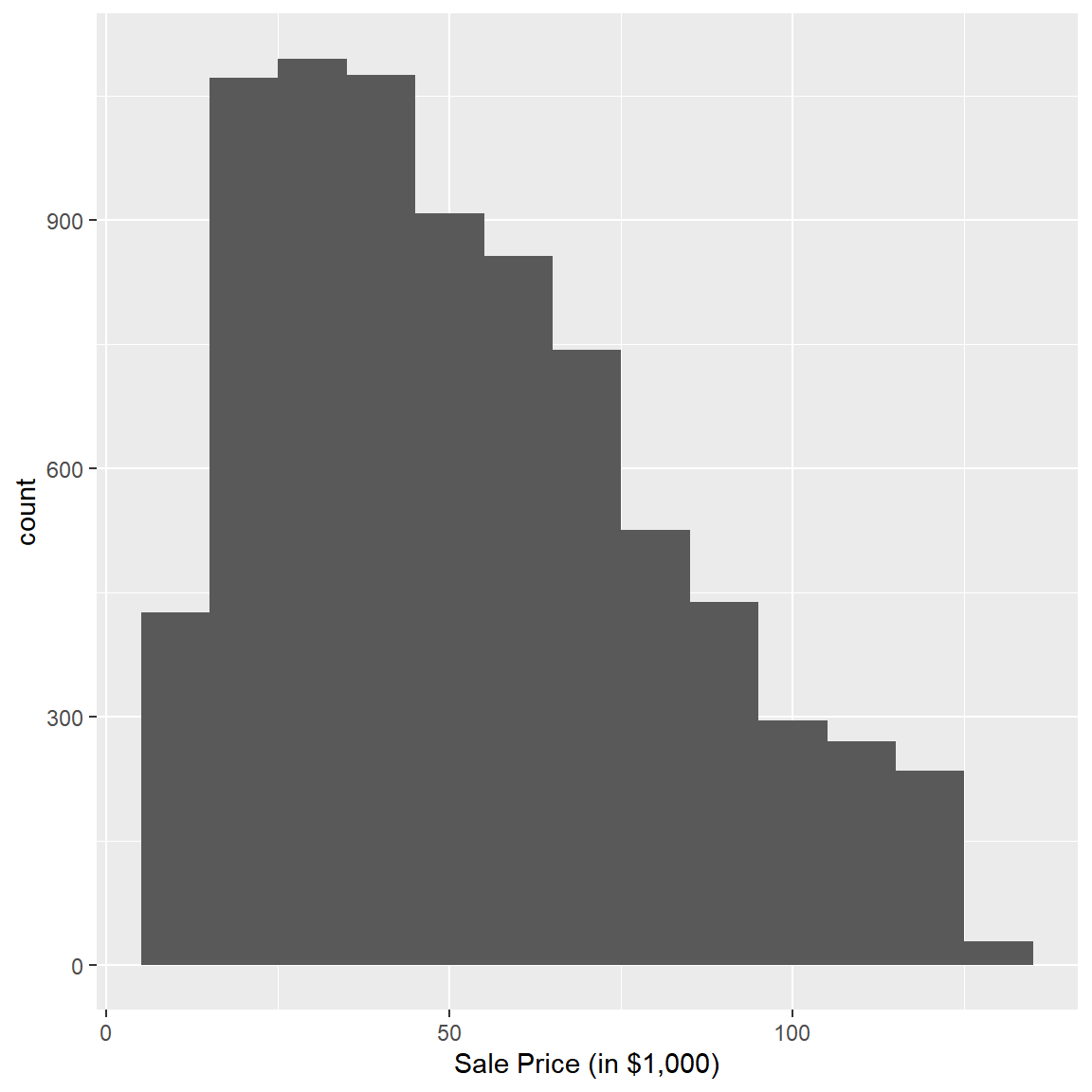
There is a quite a bit of variation in the observed prices with most prices being in the $25K to $75K range. Did prices change over the time period? Let’s check:
## average auction price by year of sale
train %>%
  group_by(saleyear) %>%
  summarize('Average Sale Price ($)' = mean(SalePrice),
            'Number of Sales' =n()) %>%
  gather(measure,value,-saleyear) %>%
  ggplot(aes(x=saleyear,y=value,group=measure,color=measure)) +
  geom_point(size=3) +
  geom_line(linetype='dotted') +
  facet_wrap(~measure,scales='free')+
  xlab('Year of Sale')+ylab(' ')+
  theme(legend.position="none",
        axis.text.x = element_text(angle = 45, hjust = 1))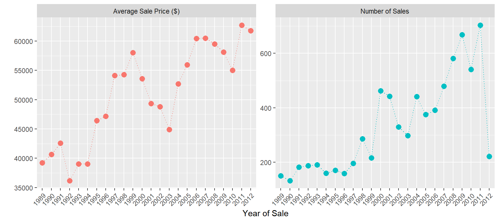
The average price increased by about $20K over the time period.
Like cars, tractors depreciate with age. Let’s see how this is reflected in the price at auction:
train %>%
  mutate(MachineAgeCat = cut(MachineAge,breaks=c(0,2,4,6,10,15,100),
                             include.lowest=T,
                             labels = c('<= 2','3-4','5-6','7-10','11-15','>15'))) %>%
group_by(saleyear,MachineAgeCat) %>%
summarize(mp = mean(SalePrice)/1000,
'Number of Sales' =n()) %>%
ggplot(aes(x=MachineAgeCat,y=mp,group=saleyear,color=factor(saleyear))) +
  geom_point(size=2) +
  geom_line() +
  labs(title = 'Average Price by Age',
       x = 'Machine Age in Years',
       y = 'Average Sale Price (in $1000)') +
  facet_wrap(~saleyear,scales='free')+
  theme(legend.position="none",
  axis.text.x = element_text(angle = 45, hjust = 1,size=8))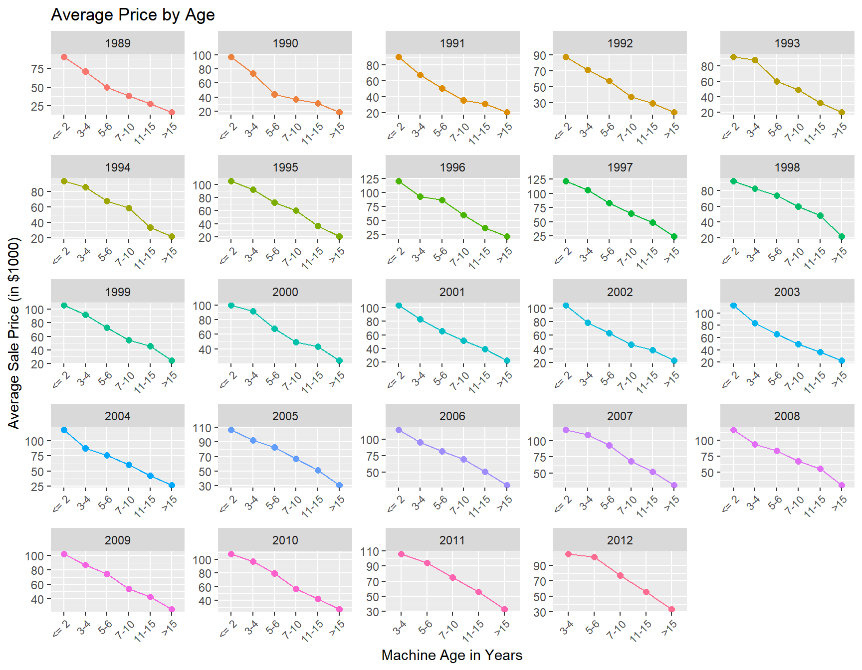
The tractor model in the data has been sold as different sub-models (or “trim”) over time. Let’s see how prices vary across sub-models:
train %>%
  group_by(saleyear,fiSecondaryDesc) %>%
  summarize(mp = mean(SalePrice)/1000,
            ns =n()) %>%
  ggplot(aes(x=saleyear,y=mp,group=fiSecondaryDesc,color=fiSecondaryDesc)) +
    geom_point(size=2) +
    geom_line() +
    labs(title = 'Average Price by Model',
         x = 'Year of Sale',
         y = 'Average Sale Price (in $1,000)')+
    facet_wrap(~fiSecondaryDesc,scales='free')+
    theme(legend.position="none",
          axis.text.x = element_text(angle = 45, hjust = 1,size=7))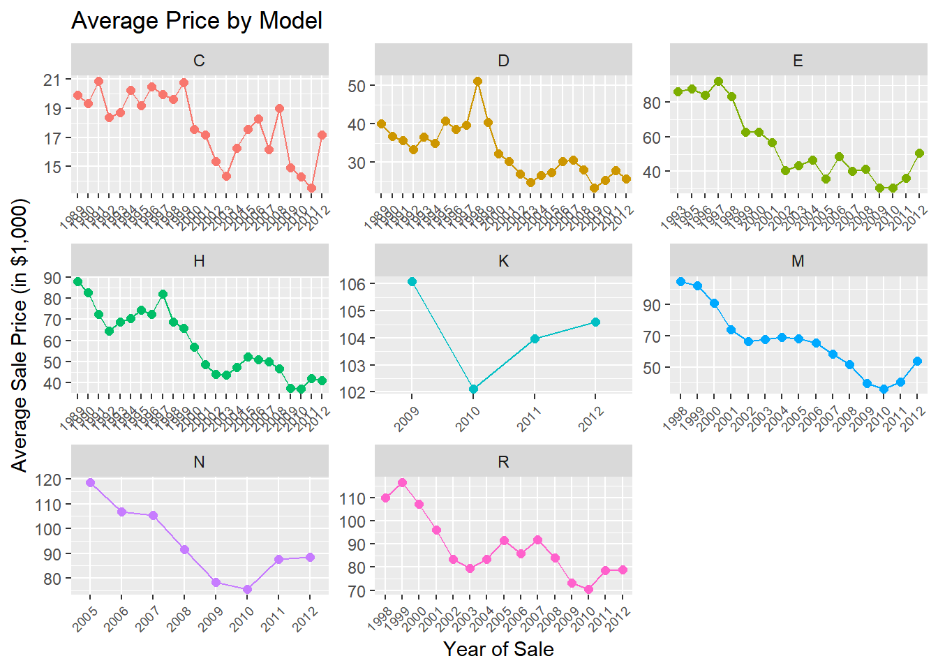
Finally, let’s see how prices vary across states:
train %>%
  group_by(state) %>%
  summarize(mean.price = mean(SalePrice)/1000) %>%
  ggplot(aes(x=fct_reorder(state,mean.price),y=mean.price)) +
  geom_point() +
  labs(title = 'Average Price by State',
    y='Average Sale Price (in $1,000)') +
  theme(axis.text.x = element_text(angle = 90, hjust = 1)) + xlab('State')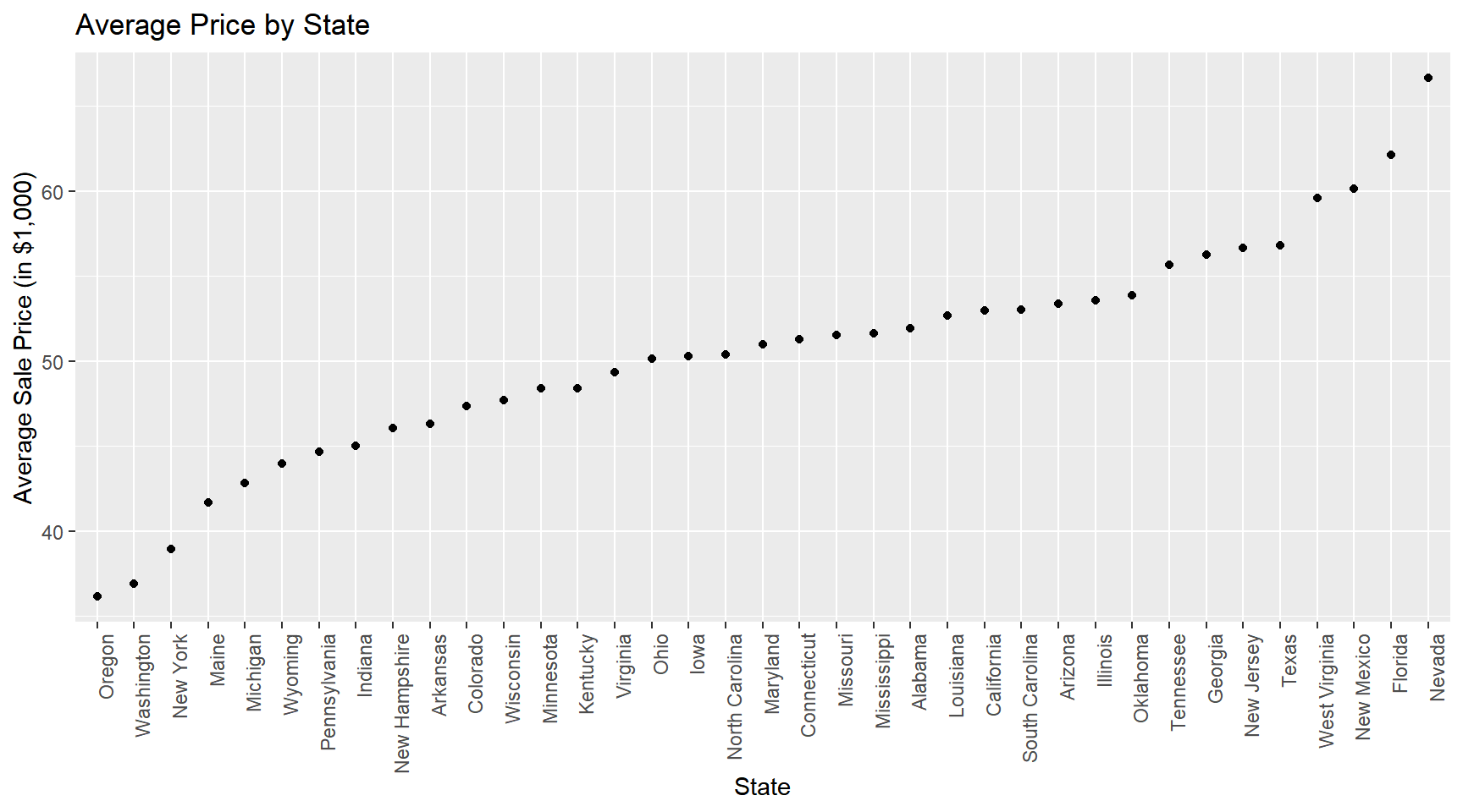
What to take away from these summaries? Well, clearly we can conclude that any predictive model that we might consider should at a minimum account for year, state, sub-model and machine age effects.
Predictive Models
In the following we will be experimenting with a range of different linear models. Recall the objective: we want to predict the prices in the test data using only the training data to calibrate the model. In order to do this we could try out a set of different models (with different features) and pick the one that fits the training data the best. However, this can easily lead to overfitting, i.e., fitting the patterns of training data very well but doing poorly on the test data. To mitigate this, it is recommended to use a hold-out or validation sample that is not use for training. We can then compare fit of different models in the validation sample, pick the best one and then re-train the best model on both the training plus validation sample. Here we use a 80/20 split of the training data.
Linear models are models that can only learn linear prediction rules: \[ y_i = \beta_0 + \beta_1 x_{i1} + \beta_2 x_{i2} + \beta_3 x_{i3} + ..... \] As we noted above the term “linear” should be interpreted in a precise way. Suppose we only have two input features \((x_1,x_2)\) to use. Then \[ \beta_0 + \beta_1 x_{i1} + \beta_2 x_{i2} \qquad \text{(M1)} \] would be a linear prediction rule, but so would \[ \beta_0 + \beta_1 x_{i1} + \beta_2 x_{i2} + \beta_3 x_{i1}^2 \qquad \text{(M2)}, \] and \[ \beta_0 + \beta_1 x_{i1} + \beta_2 x_{i2} + \beta_3 x_{i1} x_{i2} \qquad \text{(M3).} \] Note that the last two prediction rules are actually non-linear functions of \(x_{i1}\) and \(X_{i2}\). However, we still include these a linear models because we can re-write them as \[ \beta_0 + \beta_1 x_{i1} + \beta_2 x_{i2} + \beta_3 x_{i3}, \] where \(x_{i3} \equiv x_{i1}^2\) for (M2) and \(x_{i3} \equiv x_{i1} x_{i2}\) for (M3). Another way of expressing this is that the word “linear” actually refers to the parameters/weighs and not the features themselves.
Linear models are usually trained using a squared error loss function: \[ L(\beta) = \sum_{i=1}^N (y_i - [\beta_0 + \beta_1 x_{i1} + \cdots + \beta_K x_{iK} ])^2 \] “Training” the model here simply refers to picking the value of \(\beta\) that minimizes the loss function. For more complex predictive models we need to rely on an optimization algorithm to solve the minimization problem. We can do that here as well but there’s really no need: This optimization problem is simple enough that it can be solved analytically. The solution is called the “least squares” solution and a little calculus and linear algebra will provide the solution. We will not derive the solution here - for the details see here. The solution is implemented in fast functions in both R and Python.
Let’s start with a model that is clearly too simple: A model that predicts prices using only the year of sale. We already know from the above plots that we can do better, but this is just to get started.
We can train linear models easily in Python also using the scikit-learn library:
import pandas as pd
from sklearn.linear_model import LinearRegression
import numpy as np
from sklearn.metrics import mean_squared_error
import seaborn as sns
import matplotlib.pyplot as plt


train = pd.read_csv('data/auction_tractor_train.csv')
validation = pd.read_csv('data/auction_tractor_validation.csv')
test = pd.read_csv('data/auction_tractor_test.csv')
We save the test data for later and for now combine the training and validation data into one dataframe and transform the saleyear variable to categorical (and obtain the sample sizes of the training and validation data):
allDF = pd.concat([train, validation])
allDF['saleyear'] = allDF['saleyear'].astype('category')

nTrain = train.shape[0]
nAll = allDF.shape[0]
Unlike the syntax in R where we can specify the linear model using column names, here we need to construct the feature matrix and target variable manually.
We start by training a model with year of sale only. We first define a new dataframe with the relevant features and then use the get_dummies function pandas to define a new feature matrix with dummy variable coding that matches what we did in the R version above. We also define the target variable (as log of the sale price) and then create the final feature matrices for the training and validation data:
Xdf = allDF[['saleyear']]
X = pd.get_dummies(data=Xdf, drop_first=True)
y = np.log(allDF['SalePrice'])

X_train = X[0:nTrain]
y_train = y[0:nTrain]
X_valid = X[nTrain:nAll]
y_valid = y[nTrain:nAll]
What is the dimensionality of the feature matrix \(X_train\)? Let’s check:
X_train.shape(7968, 23)This looks right: We have 7,968 tractor prices in the training data and 23 dummy features (why only 23 when there are 24 years in the data? See the discussion under the R version of this case).
To set up a linear model we use the LinearRegression() function - followed by using the fit method which actually trains the model:
model = LinearRegression()
model.fit(X_train,y_train)LinearRegression()In a Jupyter environment, please rerun this cell to show the HTML representation or trust the notebook.
On GitHub, the HTML representation is unable to render, please try loading this page with nbviewer.org.
LinearRegression()
If you want to inspect the trained model weights you can do so by:
model.coef_array([ 0.02801387, 0.12700132, -0.04693634, -0.00612189, -0.00816711,
0.12662118, 0.17629127, 0.28633298, 0.33204452, 0.42368727,
0.31355244, 0.23267158, 0.26055597, 0.12662722, 0.33002234,
0.38997565, 0.47876346, 0.46300927, 0.45815626, 0.42276225,
0.36068691, 0.50542676, 0.47680719])These are identical to what we got in the R version. We can also plot them to get a sense of the evolution of the year effects:
years = allDF['saleyear'].value_counts().reset_index().sort_values(by = 'saleyear')

pl = sns.lineplot(x=years.saleyear[1:24], y = model.coef_, marker="o")
pl.set(title='Trained Weights', xlabel = 'Year', ylabel = 'Weight')
plt.show()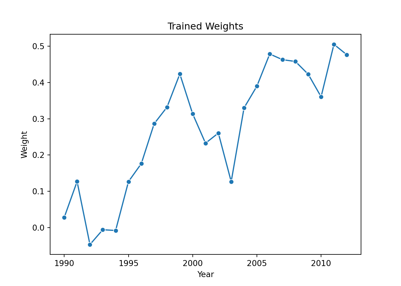
Ok - now let’s see how well we do in predicting the validation prices. We can use the predict method to get predictions given the validation features:
y_predict_year = model.predict(X_valid)

pl = sns.scatterplot(x=y_valid, y=y_predict_year)
pl.set(title='Validation Sample Fit', xlabel = 'Actual Log Prices', ylabel = 'Predicted Log Prices')
plt.axis('equal')
(8.84876307951604, 11.89430538472655, 10.324293989746174, 10.931893397234928)plt.show()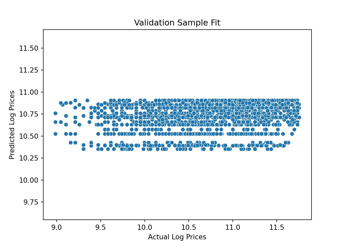
Pretty bad - just like we saw in the R version. So we add additional features: Let’s train a model with year, month and state of sale as features. We first define a new dataframe with the relevant features and then use the get_dummies function to define a new feature matrix and train the model:
Xdf = allDF[['saleyear','state','salemonth']]
X = pd.get_dummies(data=Xdf, drop_first=True)

X_train = X[0:nTrain]
X_valid = X[nTrain:nAll]


model = LinearRegression()
model.fit(X_train,y_train)LinearRegression()In a Jupyter environment, please rerun this cell to show the HTML representation or trust the notebook.
On GitHub, the HTML representation is unable to render, please try loading this page with nbviewer.org.
LinearRegression()
y_predict_base = model.predict(X_valid)Let’s check to see if we have improved the fit on the validation sample:
y_predict_base = model.predict(X_valid)

pl = sns.scatterplot(x=y_valid, y=y_predict_base)
pl.set(title='Validation Sample Fit - Base Model', xlabel = 'Actual Log Prices', ylabel = 'Predicted Log Prices')
plt.axis('equal')
(8.84876307951604, 11.89430538472655, 9.814666914027288, 11.296098999992187)plt.plot([9.0, 12], [9.0, 12], linewidth=1, color="r")
plt.show()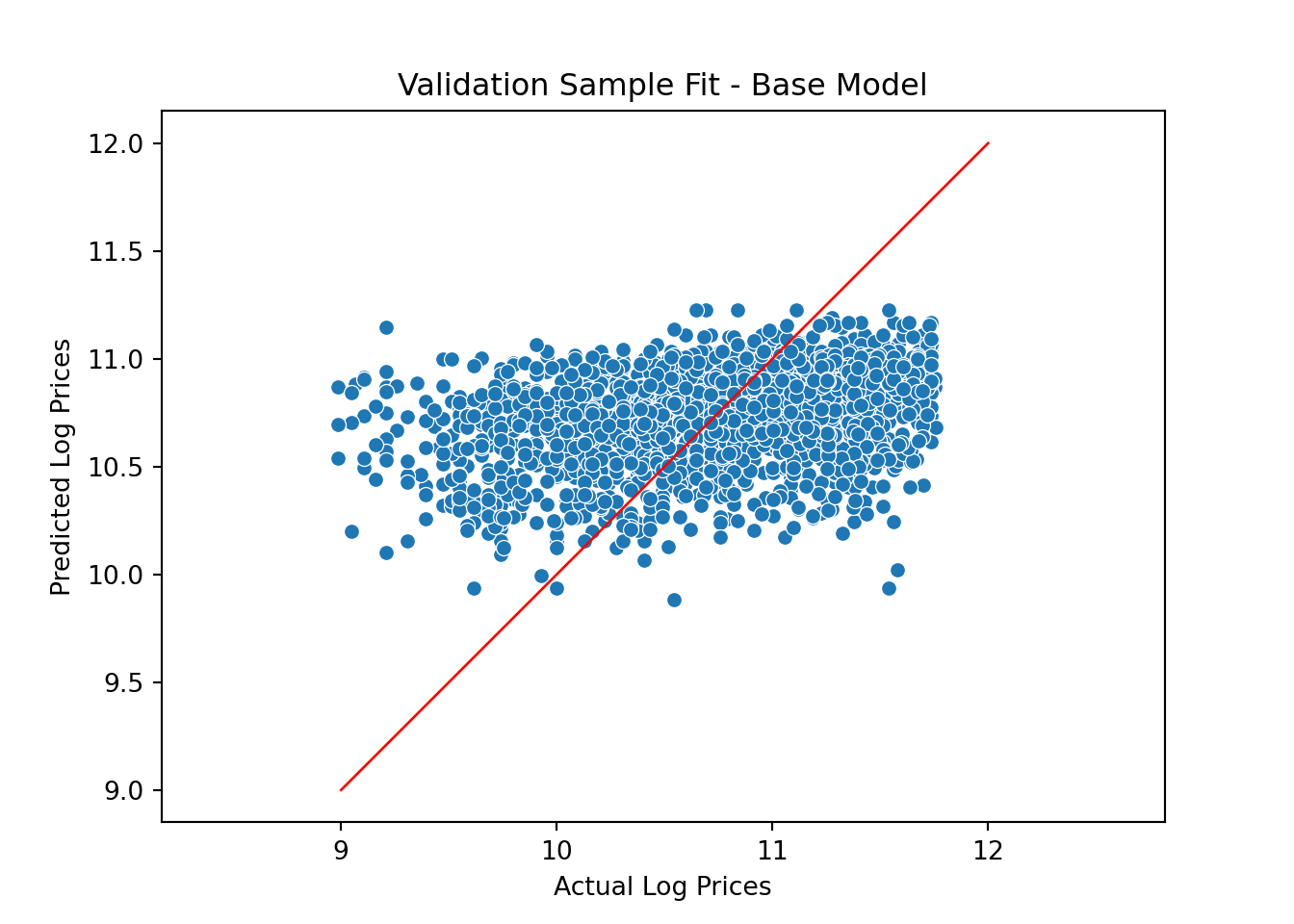
Ok - a little better but still not great. Let’s try to add the tractor model feature:
Xdf = allDF[['saleyear','state','salemonth','fiSecondaryDesc']].copy()
X = pd.get_dummies(data=Xdf, drop_first=True)

X_train = X[0:nTrain]
X_valid = X[nTrain:nAll]

model = LinearRegression()
model.fit(X_train,y_train)LinearRegression()In a Jupyter environment, please rerun this cell to show the HTML representation or trust the notebook.
On GitHub, the HTML representation is unable to render, please try loading this page with nbviewer.org.
LinearRegression()
y_predict_trim = model.predict(X_valid)The updated validation fit is
pl = sns.scatterplot(x=y_valid, y=y_predict_trim)
pl.set(title='Validation Sample Fit - Trim Model', xlabel = 'Actual Log Prices', ylabel = 'Predicted Log Prices')
plt.axis('equal')
(8.84876307951604, 11.89430538472655, 9.097228840647913, 11.792742280818336)plt.plot([9.0, 12], [9.0, 12], linewidth=1, color="r")
plt.show()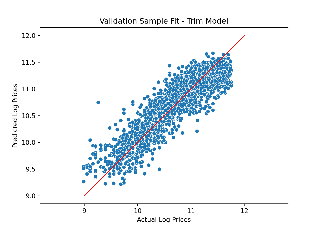
Finally, we add tractor age:
Xdf = allDF[['saleyear','state','salemonth','fiSecondaryDesc']].copy()
Xdf['MachineAgeCat'] = pd.cut(allDF["MachineAge"],
       bins=[0,2,4,6,10,15,100])

X = pd.get_dummies(data=Xdf, drop_first=True)

X_train = X[0:nTrain]
X_valid = X[nTrain:nAll]

model = LinearRegression()
model.fit(X_train,y_train)LinearRegression()In a Jupyter environment, please rerun this cell to show the HTML representation or trust the notebook.
On GitHub, the HTML representation is unable to render, please try loading this page with nbviewer.org.
LinearRegression()
y_predict_trimAge = model.predict(X_valid)The validation fit plot is
pl = sns.scatterplot(x=y_valid, y=y_predict_trimAge)
pl.set(title='Validation Sample Fit - Trim + Age Model', xlabel = 'Actual Log Prices', ylabel = 'Predicted Log Prices')
plt.axis('equal')
(8.84876307951604, 11.89430538472655, 9.346020221022, 11.957383803670663)plt.plot([9.0, 12], [9.0, 12], linewidth=1, color="r")
plt.show()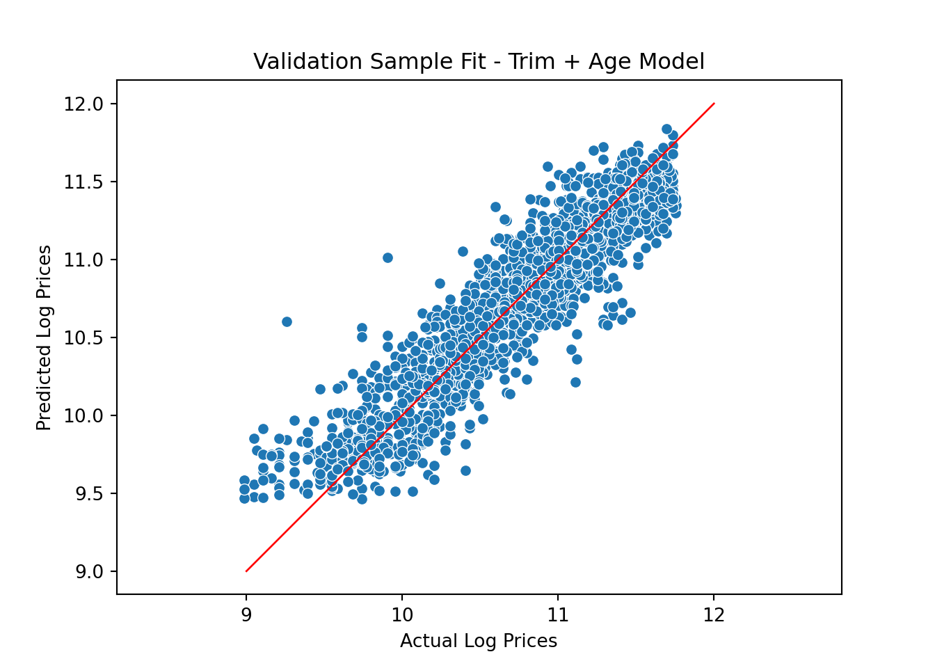
Not bad. Rather than visual inspection, we can calculate fit statistics for the validation sample. Here we go with the standard: root mean square error of the predictions. We calculate this measure for each of the candidate models and compare:
rmseYear = np.sqrt(mean_squared_error(np.exp(y_predict_year), np.exp(y_valid)))
rmseBase = np.sqrt(mean_squared_error(np.exp(y_predict_base), np.exp(y_valid)))
rmseTrim = np.sqrt(mean_squared_error(np.exp(y_predict_trim), np.exp(y_valid)))
rmseTrimAge = np.sqrt(mean_squared_error(np.exp(y_predict_trimAge), np.exp(y_valid)))

rmseDF = pd.DataFrame({'Model':['Year', 'Base', 'Trim', 'Time_Age'], 'RMSE':[rmseYear, rmseBase, rmseTrim, rmseTrimAge]})

pl = sns.barplot(x='Model', y = 'RMSE',data=rmseDF)
pl.set(title='Model Comparison: Validation Fit', xlabel = 'Model', ylabel = 'RMSE')
plt.show()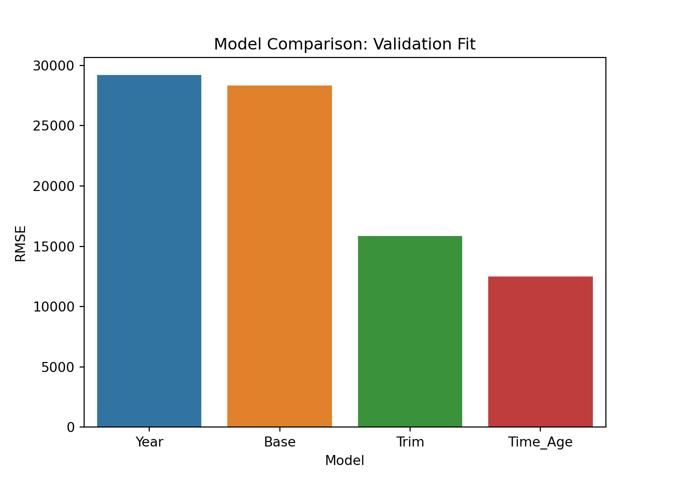
These results are identical to the ones we got above using R. We are going to go with the last model so we re-train on the training+validation data:
allDF = pd.concat([train, validation, test])
allDF['saleyear'] = allDF['saleyear'].astype('category')

Xdf = allDF[['saleyear','state','salemonth','fiSecondaryDesc']].copy()
Xdf['MachineAgeCat'] = pd.cut(allDF["MachineAge"],
       bins=[0,2,4,6,10,15,100])

X = pd.get_dummies(data=Xdf, drop_first=True)
y = np.log(allDF['SalePrice'])

nTrain = train.shape[0]+validation.shape[0]
nAll = allDF.shape[0]

X_train = X[0:nTrain]
y_train = y[0:nTrain]
X_test = X[nTrain:nAll]
y_test = y[nTrain:nAll]

model = LinearRegression()
model.fit(X_train,y_train)LinearRegression()In a Jupyter environment, please rerun this cell to show the HTML representation or trust the notebook.
On GitHub, the HTML representation is unable to render, please try loading this page with nbviewer.org.
LinearRegression()
Ok - now we are ready to do what was our goal the whole time: generate a set of predictions for the test data. In a real prediction context (like a competition) we wouldn’t be able to see how successful these predictions are (since we don’t know the actual prices in the test data). Here we cheat and assume we actually know the real test prices to see the final performance of our model:
y_predict = model.predict(X_test)
rmse_test = np.sqrt(mean_squared_error(np.exp(y_predict), np.exp(y_test)))
rmse_test12335.991531816675This is identical performace to the R version (as it should be). Note again that in an actual real world example we wouldn’t know y_test (that’s what we are building the model to predict).
Let’s start with a model that is clearly too simple: A model that predicts prices using only the year of sale. We already know from the above plots that we can do better, but this is just to get started. You specify a linear model in R using the lm command:
## linear model using only year to predict prices
lm.year <- lm(log(SalePrice)~saleyear, data = train)

## look at model estimates
sum.lm.year <- summary(lm.year)
When predicting things like prices (or sales), it is usually better to first build a model predicting the (natural) log of price (or sales). Then we can always transform the log-predictions to get back to the original scale. It is important to be aware that we have coded the year of sale as a factor in R. If we hadn’t then the model would be one where the log of sale price would be a linear function of the sale year, i.e., a linear trend. There might be contexts where this would make sense but here we want something more flexible. When you enter a feature that is coded as a factor in R, then R will “one hot-code” the feature. To understand what this means, suppose we only had three years of data: 1989, 1990 and 1991. One-hot coding means creating three “dummy” variables as follows:
| color | D_89 | D_90 | D_91 |
|---|---|---|---|
| 1989 | 1 | 0 | 0 |
| 1990 | 0 | 1 | 0 |
| 1991 | 0 | 0 | 1 |
We will then enter two of the three newly created dummy variables as features into the model. Why not all of them? There’s a technical reason for this: We already have an intercept or bias term in the model (R will automatically add this) and if we use all three dummy variables then the model will be over-determined (the minimization problem above will not have a unique solution). You can think of the intercept term as setting a baseline. If we drop the “89” dummy, then the parameters to D_90 and D_91 will be offsets relative to the baseline of 1989.
The object sum.lm.year contains the calibrated (or estimated) coefficients for your model (along with other information):
Call:
lm(formula = log(SalePrice) ~ saleyear, data = train)

Residuals:
     Min       1Q   Median       3Q      Max
-1.83441 -0.39156  0.05323  0.46060  1.32901

Coefficients:
              Estimate Std. Error t value Pr(>|t|)
(Intercept)  10.398848   0.048041 216.459  < 2e-16 ***
saleyear1990  0.028014   0.070201   0.399   0.6899
saleyear1991  0.127001   0.064983   1.954   0.0507 .
saleyear1992 -0.046936   0.064511  -0.728   0.4669
saleyear1993 -0.006122   0.064285  -0.095   0.9241
saleyear1994 -0.008167   0.066978  -0.122   0.9030
saleyear1995  0.126621   0.065923   1.921   0.0548 .
saleyear1996  0.176291   0.067080   2.628   0.0086 **
saleyear1997  0.286333   0.063922   4.479 7.59e-06 ***
saleyear1998  0.332045   0.059384   5.591 2.33e-08 ***
saleyear1999  0.423687   0.062620   6.766 1.42e-11 ***
saleyear2000  0.313552   0.055338   5.666 1.51e-08 ***
saleyear2001  0.232672   0.055645   4.181 2.93e-05 ***
saleyear2002  0.260556   0.058000   4.492 7.14e-06 ***
saleyear2003  0.126627   0.058969   2.147   0.0318 *
saleyear2004  0.330022   0.055661   5.929 3.17e-09 ***
saleyear2005  0.389976   0.056875   6.857 7.57e-12 ***
saleyear2006  0.478763   0.056562   8.464  < 2e-16 ***
saleyear2007  0.463009   0.055081   8.406  < 2e-16 ***
saleyear2008  0.458156   0.053923   8.496  < 2e-16 ***
saleyear2009  0.422762   0.053194   7.948 2.16e-15 ***
saleyear2010  0.360687   0.054333   6.638 3.38e-11 ***
saleyear2011  0.505427   0.052949   9.545  < 2e-16 ***
saleyear2012  0.476807   0.062271   7.657 2.13e-14 ***
---
Signif. codes:  0 '***' 0.001 '**' 0.01 '*' 0.05 '.' 0.1 ' ' 1

Residual standard error: 0.5903 on 7944 degrees of freedom
Multiple R-squared:  0.06563,   Adjusted R-squared:  0.06293
F-statistic: 24.26 on 23 and 7944 DF,  p-value: < 2.2e-16
Notice that while we have data from 1989 to 2012, there is no effect for 1989 - the model dropped this automatically. As mentioned above, think of the intercept as the base level for the dropped year - the average log price in 1989. The predicted average log price in 1990 is then 0.028 higher. Why? Like in the satisfaction example above, you should think of each effect as being multiplied by a one or a zero depending on if the year correspond to the effect in question (here 1990). This corresponds to an increase in price of about 8%. Similarly, the predicted average log price in 1991 would be 10.399+0.127.
In order to plot the estimated year effects it is convenient to put them in a R data frame. We can also attach measures of uncertainty of the estimates (confidence intervals) at the same time:
## put results in a data.frame using the broom package
library(broom)
results.df <- tidy(lm.year,conf.int = T)
We can now plot elements of this data frame to illustrate effects. We can use a simple function to extract which set of effects to plot. Here there is only saleyear to consider:
## ------------------------------------------------------
## Function to extract coefficients for plots
## ------------------------------------------------------
extract.coef <- function(res.df,var){
res.df %>%
filter(grepl(var,term)) %>%
separate(term,into=c('var','level'),sep=nchar(var))
}
##-------------------------------------------------------

## plot estimated trend
extract.coef(results.df,"saleyear") %>%
  ggplot(aes(x=level,y=estimate,group=1)) +
  geom_point() +
  geom_line(linetype='dotted') +
  geom_hline(aes(yintercept=0)) +
  theme(axis.text.x = element_text(angle = 90, hjust = 1))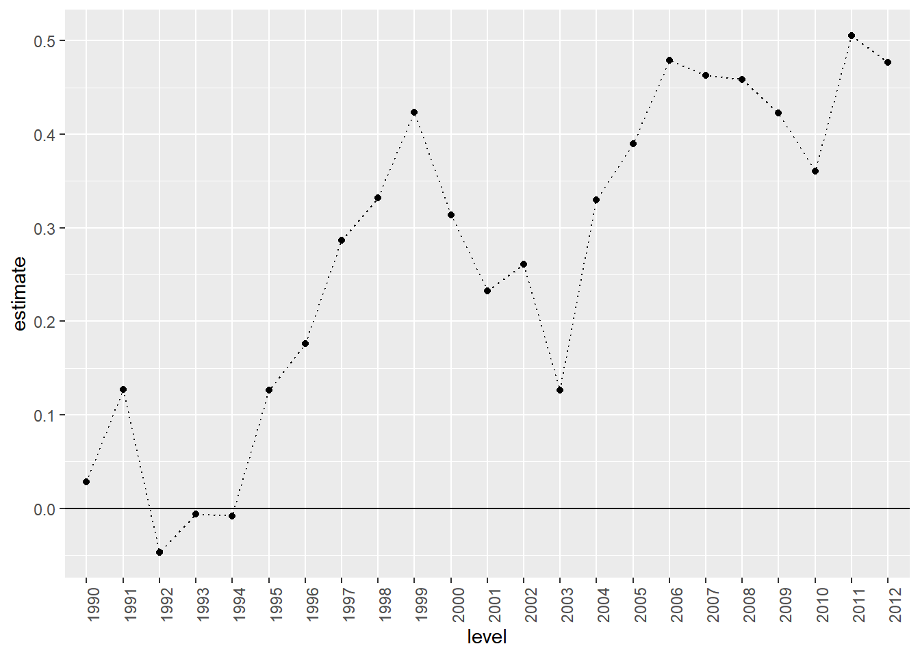
This plot closely resembles the plot above of average prices per year. This is not strange since our “model” basically just calculates the average log price per year.
If you want to add confidence intervals to the plot, you can use the geom_pointrange option:
extract.coef(results.df,"saleyear") %>%
  ggplot(aes(x=level,y=estimate,ymin=conf.low,ymax=conf.high,group=1)) +
  geom_pointrange() +
  geom_line(linetype='dotted') +
  geom_hline(aes(yintercept=0)) +
  theme(axis.text.x = element_text(angle = 90, hjust = 1))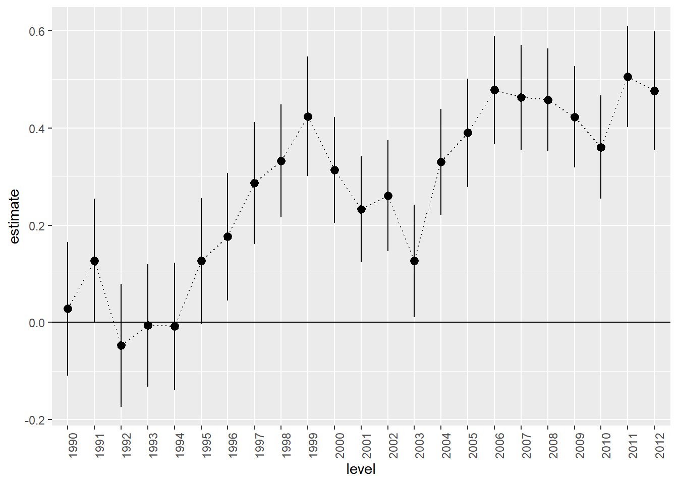
Let’s see how well this model predicts the validation sample:
pred.df <- data.frame(log.sales=log(validation$SalePrice),
                      log.sales.pred=predict(lm.year,newdata=validation))

pred.df %>%
  ggplot(aes(x=log.sales,y=log.sales.pred)) +
  geom_point(size=2)  +
  labs(title = 'Validation Sample Fit',
       x = 'Actual Log Prices',
       y = 'Predicted Log Prices') +
  xlim(min(pred.df$log.sales),max(pred.df$log.sales)) +
  ylim(min(pred.df$log.sales),max(pred.df$log.sales))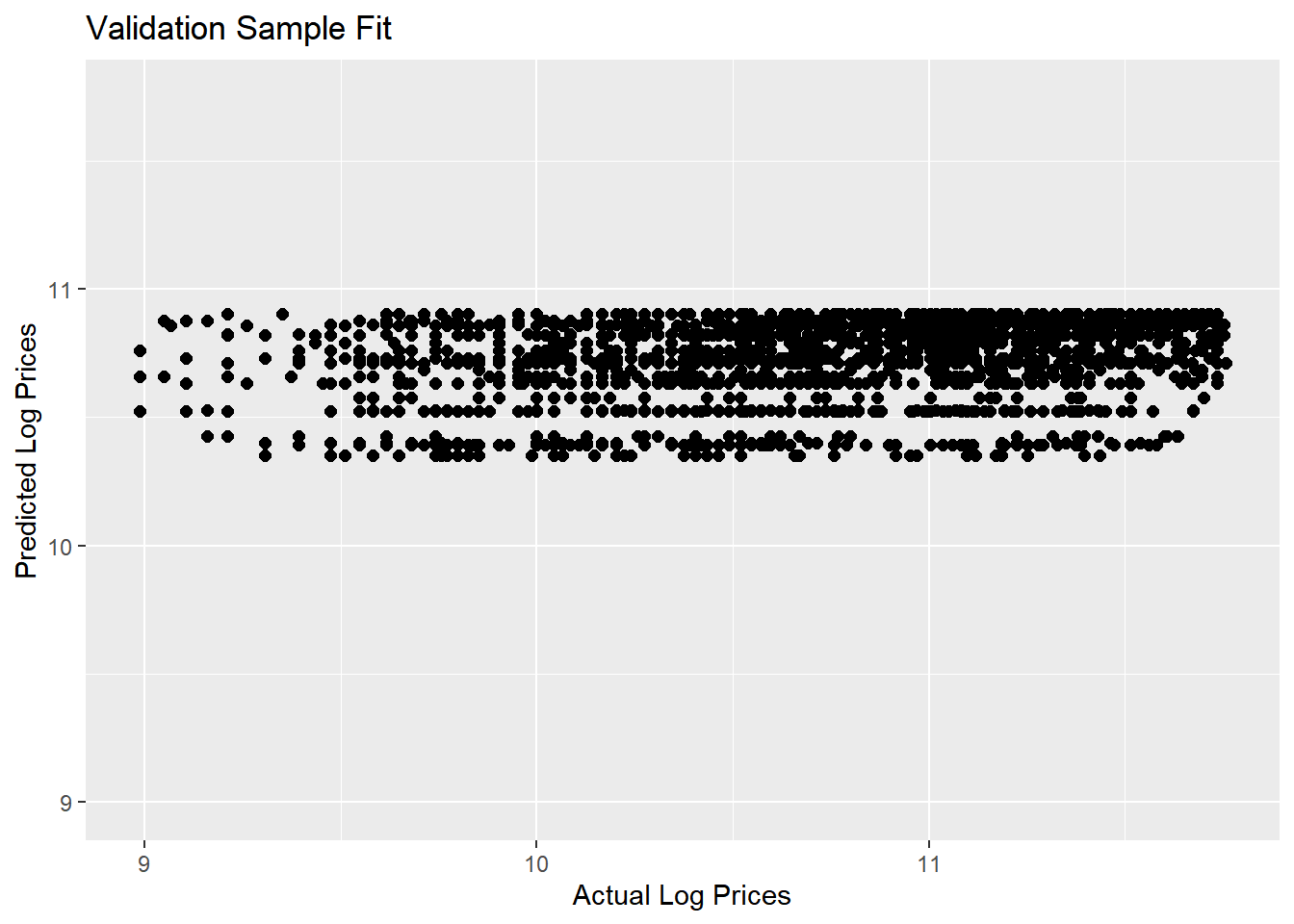
Yikes….not a good set of predictions: Actual log prices vary from 9 to over 11.5 and out predictions are kind of pathetic - only varying between 10.3 and 10.9.
Let’s consider a model that takes into account that auctions occur throughout the year and across many states. We do this by including month and state effects:
lm.base <- lm(log(SalePrice)~state + saleyear + salemonth,
              data = train)

results.df <- tidy(lm.base,conf.int = T)
We wont show the estimated coefficients here (since there are too many of them), but this model explains 11.9% of the overall variation in log prices in the estimation sample. That’s better than before but we have also included more effects. How about in terms of predictions? Let’s check:
pred.df <- data.frame(log.sales = log(validation$SalePrice),
                      log.sales.pred = predict(lm.base,newdata=validation))

pred.df %>%
  ggplot(aes(x=log.sales,y=log.sales.pred)) +
  geom_point(size=2)  +
  geom_line(aes(x=log.sales,y=log.sales)) +
  labs(title = 'Validation Sample Fit',
       x = 'Actual Log Prices',
       y = 'Predicted Log Prices') +
  coord_fixed()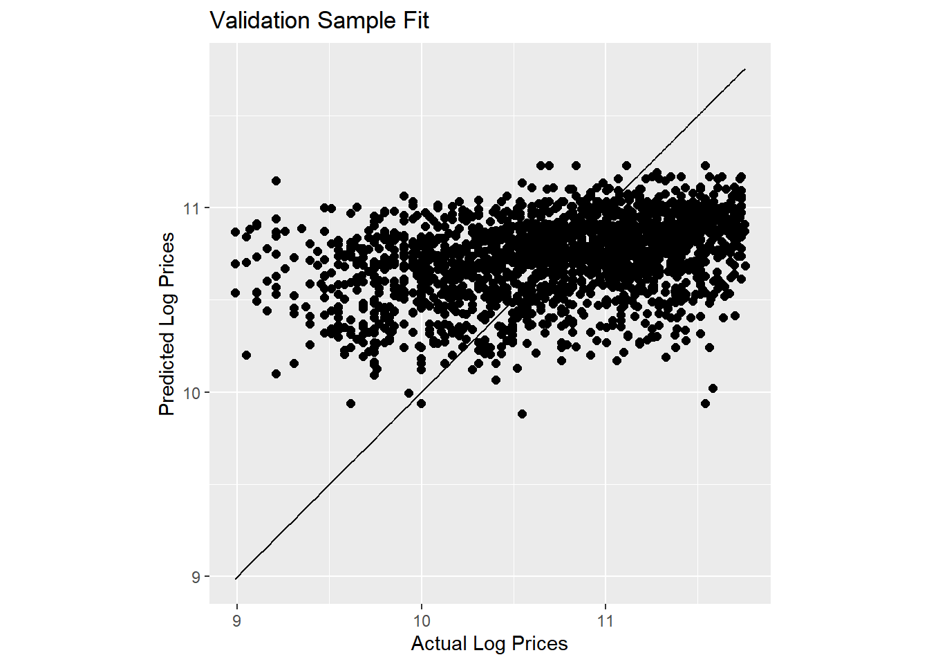
Here we have added a 45 degree line to the plot. Our predictions are slightly better than before but still not great.
Now let’s add information about the sub-model of each tractor:
lm.trim <- lm(log(SalePrice)~state+saleyear+salemonth + fiSecondaryDesc,
              data = train)

results.trim.df <- tidy(lm.trim,conf.int = T)
With this model we are explaining 79.7% of the overall variation in log prices. Let’s plot the predictions with information about each model type:
pred.df <- data.frame(log.sales = log(validation$SalePrice),
                      log.sales.pred = predict(lm.trim,newdata=validation),
                      trim = validation$fiSecondaryDesc)

pred.df %>%
  ggplot(aes(x=log.sales,y=log.sales.pred)) +
  geom_text(aes(color=trim,label=trim),size=2) +
  geom_line(aes(x=log.sales,y=log.sales)) +
  labs(title = 'Validation Sample Fit',
       x = 'Actual Log Prices',
       y = 'Predicted Log Prices') +
  coord_fixed() +
  theme(legend.position="none")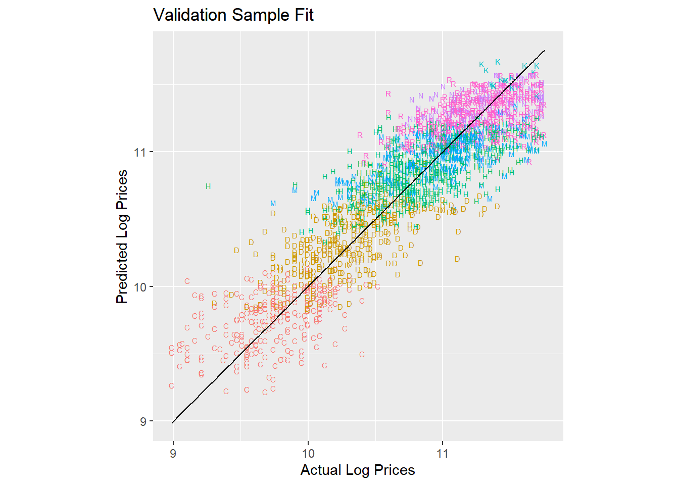
Ok - we are getting close to something useful. But we saw from the plots above that the age of the tractor was important in explaining prices so let’s add that to the model as a factor:
train2 <- train %>%
  filter(MachineAge >= 0) %>%
  mutate(MachineAgeCat = cut(MachineAge,
                             breaks=c(0,2,4,6,10,15,100),
                             include.lowest=T,
                             labels = c('<= 2','3-4','5-6','7-10','11-15','>15')))

lm.trim.age <- lm(log(SalePrice)~state + saleyear + salemonth + fiSecondaryDesc + MachineAgeCat,
                  data = train2)

results.trim.age.df <- tidy(lm.trim.age,conf.int = T)
Now we are explaining 86% of the overall variation in log prices. Let’s take a closer look at the estimated age effects:
extract.coef(results.trim.age.df,"MachineAgeCat") %>%
  mutate(level = factor(level,levels=levels(train2$MachineAgeCat))) %>% ggplot(aes(x=level,y=estimate,ymin=conf.low,ymax=conf.high,group=1)) +
  geom_pointrange() + geom_line(linetype='dotted') +
  geom_hline(aes(yintercept=0)) +
  theme(axis.text.x = element_text(angle = 90, hjust = 1)) +
  xlab('Machine Age')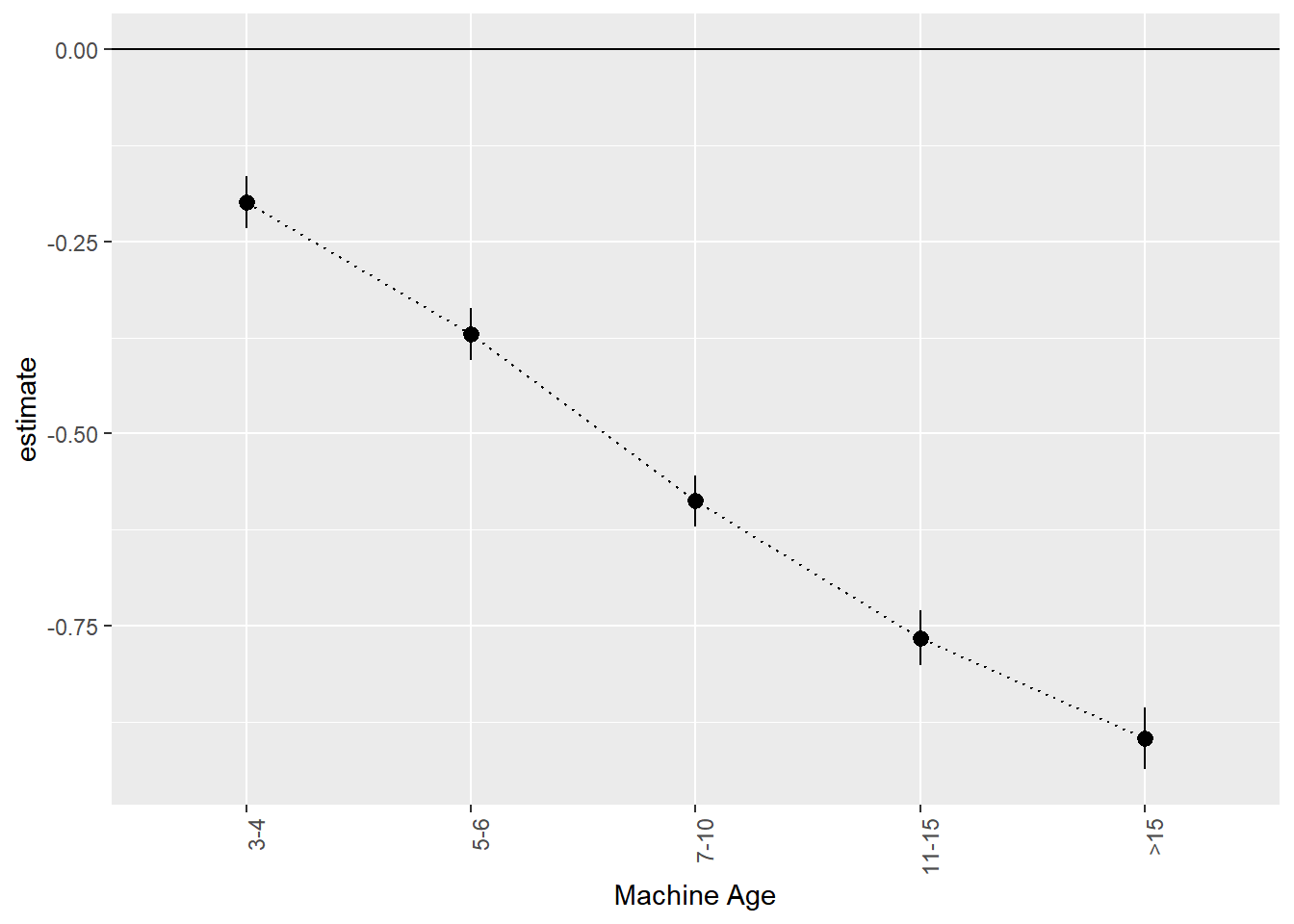
We can think of this as an age-depreciation curve. Compared to two year old (or less) tractors, 3 to 4 year old tractors are on average worth 0.199 less on the log-price scale. This corresponds to exp(0.199)-1 = 22% percent. 11 to 15 year old tractors are worth exp(0.766)-1=115% less than two year old or younger tractors.
We can also look at where tractors are cheapest by looking at the state effects:
extract.coef(results.trim.age.df,"state") %>% ggplot(aes(x=reorder(level,estimate),y=estimate,ymin=conf.low,ymax=conf.high,group=1)) +
  geom_pointrange() +
  geom_hline(aes(yintercept=0)) +
  theme(axis.text.x = element_text(angle = 90, hjust = 1)) +
  xlab('State')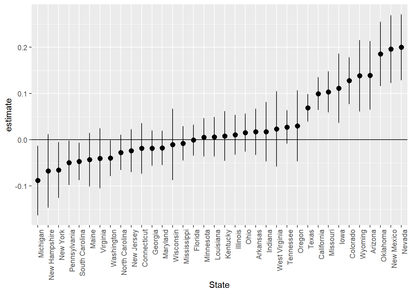
Tractors are cheapest in New York, New Jersey and Michigan and most expensive in Oklahoma, New Mexico and Nevada.
Finally, here are the predictions for the predictive model with age included:
validation2 <- validation %>%
  filter(MachineAge >= 0) %>%
  mutate(MachineAgeCat = cut(MachineAge,
                             breaks=c(0,2,4,6,10,15,100),
                             include.lowest=T,
                             labels = c('<= 2','3-4','5-6','7-10','11-15','>15')))


pred.df <- data.frame(log.sales = log(validation2$SalePrice),
                      log.sales.pred = predict(lm.trim.age,newdata = validation2),
                      trim = validation$fiSecondaryDesc)

pred.df %>%
  ggplot(aes(x=log.sales,y=log.sales.pred)) +
  geom_text(aes(color=trim,label=trim),size=2) + geom_line(aes(x=log.sales,y=log.sales)) +
  xlab('Actual Log Prices') + ylab('Predicted Log Prices') + coord_fixed() +
  theme(legend.position="none")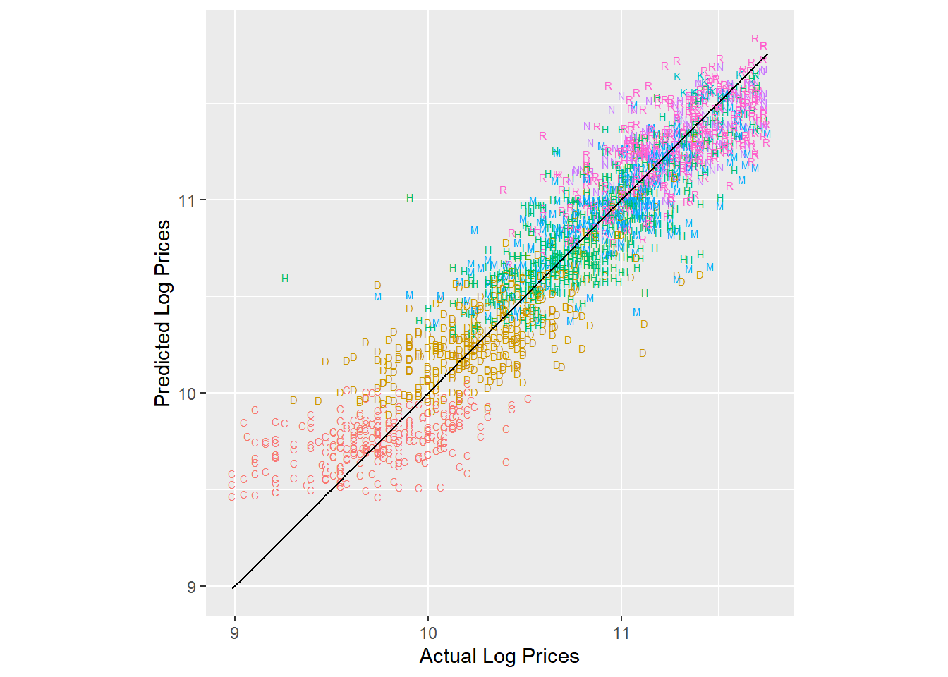
It is often useful to calculate summary measures of the model performance on the validation data. Here we calculate two metrics: Mean Absolute Prediction Error and Root Mean Square Prediction Error. The smaller these are, the better is the predictive ability of the model. We calculate these on the same scale as the outcome we really care about - price:
pred.df <- data.frame(price = validation2$SalePrice,
                      Year = exp(predict(lm.year,newdata = validation2)),
                      Base = exp(predict(lm.base,newdata = validation2)),
                      Trim = exp(predict(lm.trim,newdata = validation2)),
                      Time_Age = exp(predict(lm.trim.age,newdata = validation2)))

pred.df %>%
  gather(model,pred,-price) %>%
  group_by(model) %>%
  summarize(MAE = mean(abs(price-pred)),
            RMSE = sqrt(mean((price-pred)**2))) %>%
  gather(metric,value,-model) %>%
  ggplot(aes(x=model,y=value,fill=model)) + geom_bar(stat='identity') +
  facet_wrap(~metric)+theme(legend.position="none")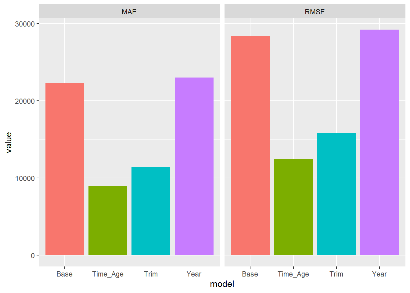
For both metrics we see that the model with both trim and age seems to do the best. We will use this model to give us our final predictions for the test data. To get our final predictions we first train our chosen model on the full training data:
trainFull <- bind_rows(train,validation) %>%
  mutate(MachineAgeCat = cut(MachineAge,
                             breaks=c(0,2,4,6,10,15,100),
                             include.lowest=T,
                             labels = c('<= 2','3-4','5-6','7-10','11-15','>15')))

lm.trim.age <- lm(log(SalePrice)~state+saleyear+salemonth + fiSecondaryDesc+MachineAgeCat,
                     data=trainFull)
Then we obtain our predictions for the test sample:
test <- test %>%
  mutate(MachineAgeCat = cut(MachineAge,
                             breaks=c(0,2,4,6,10,15,100),
                             include.lowest=T,
                             labels = c('<= 2','3-4','5-6','7-10','11-15','>15')))

predTest <- data.frame(pred = exp(predict(lm.trim.age,newdata = test)))
These are the predictions we would submit to a prediction competition. In this case we can calculate what our prediction metric would be (assuming that MSE or RMSE is used by the competition):
predTest$price <- test$SalePrice

predTest %>%
  summarize(MAE = mean(abs(price - pred)),
            MSE = mean((price - pred)**2),
            RMSE = sqrt(MSE))
MAE MSE RMSE
1 9040.194 152176687 12335.99Exercise
We still haven’t used any of the specific tractor characteristics as additional predictive information such as Enclosure (the type of “cabin” of the tractor), Travel_Controls (part of controlling the machine), Ripper (the attachment that goes in the ground to cultivate the soil), Transmission, Blade_Type and Hydraulics. Can you develop a better performing model than the one above using this information?
Regularizing a Linear Predictor
Training linear models like the ones described above are typically done by minimizing the least squares criterion:
\[ L(\beta) = \sum_{i=1}^N (y_i - \beta_0 - \beta_1 x_{i1} - \beta_2 x_{i2} - ...)^2 \] This is why the method is called “least squares” - we are minimizing the squared prediction errors. This often works extremely well but in cases where we have many predictors compared to the number of observations, least squares is prone to overfitting the training data which often leads to poor predictive performance. To prevent this we can make it harder for the algorithm to fit the training data (and thereby reduce the risks of overfitting) by adding a penalty term to the least squares criterion:
\[ ss_p(\beta) = \sum_{i=1}^N (y_i - \beta_0 - \beta_1 x_{i1} - \beta_2 x_{i2} - ...)^2 + \lambda p(\beta) \]
where \(p\) is a penalty function and \(\lambda\) is a weight given to the penalty. The most popular penalty functions are \[ p_{\rm LASSO}(\beta) = \sum_k |\beta_k| , ~~~~p_{\rm RIDGE}(\beta) = \tfrac{1}{2} \sum_k \beta_k^2 \] The first penalty is also called L1 or LASSO, while the second is called L2 or Ridge Regression. It also possible to use a combinations of these two penalties (this is called the Elastic Net penalty). The basic idea in all of them is the same: penalize large values of the \(\beta\) weights - this makes overfitting harder. In the LASSO case, it can be shown that many of the \(\beta\) weights often minimizes the criterion at zero. This means that the LASSO version can be thought of as a feature selection tool. The \(\lambda\) weight is either chosen by the researcher directly or can be tuned using a cross-validation procedure.
Case Study: Some Synthetic Data
To illustrate the advantages of regularization, we can start by considering some synthetic data. This is an ideal way to learn about new procedures. The data contains 1,000 observations and 300 numeric features. The data has been generated so only two out of the 300 features are relevant in predicting the output. This is an example of a situation where the risks of overfitting are large.
We start by importing the required libraries and data. We will use the scikit library to train the model using LASSO. We will use a 50-50 split of training and validation.
import pandas as pd
from sklearn.linear_model import LinearRegression
from sklearn.linear_model import Lasso
from sklearn.linear_model import LassoCV
import numpy as np
from sklearn.metrics import mean_squared_error
import seaborn as sns
import matplotlib.pyplot as plt


## get data and set up training and validation
allDF = pd.read_csv('data/simData.csv')

n = allDF.shape[0]
nTrain = 500
nVal = n - nTrain

Xdf = allDF.loc[:, 'X.1':'X.300'].copy()
Xtrain = Xdf[0:nTrain]
XVal = Xdf[nTrain:n]
yTrain = allDF.y[0:nTrain]
yVal = allDF.y[nTrain:n]
Let’s start by using the standard sum of squares loss function - this will be our baseline that we can compare LASSO to:
model = LinearRegression()
model.fit(Xtrain,yTrain)LinearRegression()In a Jupyter environment, please rerun this cell to show the HTML representation or trust the notebook.
On GitHub, the HTML representation is unable to render, please try loading this page with nbviewer.org.
LinearRegression()
y_predict = model.predict(XVal)
rmseLM = np.sqrt(mean_squared_error(yVal, y_predict))
rmseLM1.5425351998137469Now let’s see if we can improve on this using LASSO where we add the L1 penalty term to the sum of squares loss function.
To train the model using LASSO we need to specify a value of \(\lambda\), i.e., how severely we want the penalty to be. The closer you set this to zero, the closer the trained weights will be to the least squares solution above. The higher you set \(\lambda\), the higher is the chance that a given weight will be set to zero, i.e., that feature will be eliminated from the predictive model. In most cases it is hard to know what a reasonable value of \(\lambda\) should be. In this situation we usually use the method of cross-validation to learn what a good value of \(\lambda\) is. Cross-validation is based on the following idea: Divide the training data into \(K\) equal size groups (or “folds”) and then train the model on all data except one of the groups which acts as the validation sample. Now repeat this procedure (i.e., change to make another group the validation group). When you are done, take the average performance in predicting the validation group as your final metric. We do this across a range of values of \(\lambda\) to determine the best one. Here is the step-by-step description:
Set number of folds for cross-validation \(K\) and set a sequence of lambdas to search over \(\lambda_1,\dots,\lambda_L\).
For each \(\lambda_l\), \(l=1,\dots,L\):
- For fold \(k\), \(k=1,\dots,K\): train Lasso model on remaining \(K-1\) folds and predict outcome for fold \(k\).
- Compute average MSE or RMSE across the \(K\) folds
Pick \(\lambda\) with smallest average MSE (or RMSE) computed in step 2.
Let’s try this out with 5-fold cross validation (i.e., 5 groups). Note: in scikit-learn the \(\lambda\) parameter is called “alpha”:
nFolds = 5
model = LassoCV(cv = nFolds)
model.fit(Xtrain,yTrain)

# get average MSE across the foldsLassoCV(cv=5)In a Jupyter environment, please rerun this cell to show the HTML representation or trust the notebook.
On GitHub, the HTML representation is unable to render, please try loading this page with nbviewer.org.
LassoCV(cv=5)
avgMSE = model.mse_path_.mean(axis=-1)

# plot
pl = sns.lineplot(x=np.log(model.alphas_), y = avgMSE)
pl.set(title='Cross Validation Results', xlabel = 'alpha', ylabel = 'MSE')
plt.show()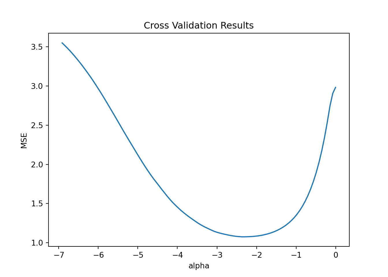
This plot has all the candidate \(\lambda\) (=\(\alpha\)) values on the x-axis (plotted on the log scale) and the average mean squared error (MSE) on the y-axis. The line shows the average MSE for each \(\lambda\) across the 5 folds. Recall that as \(\lambda\) gets very small we get closer to the standard squared error loss. In this example it looks like we minimize MSE just below -2 on the log scale. The \(\lambda\) with the smallest MSE is returned automatically:
model.alpha_0.09960724988452781Ok - now we make predictions using this \(\lambda\) value:
model = Lasso(alpha=model.alpha_)
model.fit(Xtrain,yTrain)Lasso(alpha=0.09960724988452781)In a Jupyter environment, please rerun this cell to show the HTML representation or trust the notebook.
On GitHub, the HTML representation is unable to render, please try loading this page with nbviewer.org.
Lasso(alpha=0.09960724988452781)
We can now compare the two models:
y_predict = model.predict(XVal)
rmseLasso = np.sqrt(mean_squared_error(y_predict, yVal))
rmseLasso0.9705371578950823rmseLM1.5425351998137469We see about a 33% reduction in prediction error (measured as RMSE) by going with the LASSO.
We start by importing the required libraries and data. We will use the glmnet library to train the model using LASSO (this library also contains the option of using the full elastic net penalty but we will not do that here). We will use a 50-50 split of training and validation.
library(tidyverse)
library(glmnet)

df <- read_csv('data/simData.csv')

n <- nrow(df)
nTrain <- 500                 # 50-50 split
nVal <- n - nTrain

trainDF <- df[1:nTrain,]
valDF <- df[(nTrain+1):n,]
Let’s start by using the standard sum of squares loss function - this will be our baseline that we can compare LASSO to:
modelLM <- lm(y~., data = trainDF)             # pick all 300 features in the data

yPredict <- predict(modelLM, newdata = valDF)  # predict on validation data
rmseLM <- sqrt(mean((valDF$y - yPredict)**2))  # RMSE for validation data
This leads to an RMSE of 1.54.
Now let’s see if we can improve on this using LASSO where we add the L1 penalty term to the sum of squares loss function. The glmnet library requires that we set up the model using the features as a matrix and the output as a single array:
y <- df$y
X <- df %>%
  select(-y) %>%
  as.matrix()

yTrain <- y[1:nTrain]
yVal <- y[(nTrain+1):n]

xTrain <- X[1:nTrain,]
xVal <- X[(nTrain+1):n,]
Here xTrain is a 500 x 300 array with all the features for the training data.
To train the model using LASSO we need to specify a value of \(\lambda\), i.e., how severely we want the penalty to be. The closer you set this to zero, the closer the trained weights will be to the least squares solution above. The higher you set \(\lambda\), the higher is the chance that a given weight will be set to zero, i.e., that feature will be eliminated from the predictive model. In most cases it is hard to know what a reasonable value of \(\lambda\) should be. In this situation we usually use the method of cross-validation to learn what a good value of \(\lambda\) is. Cross-validation is based on the following idea: Divide the training data into \(K\) equal size groups (or “folds”) and then train the model on all data except one of the groups which acts as the validation sample. Now repeat this procedure (i.e., change to make another group the validation group). When you are done, take the average performance in predicting the validation group as your final metric. We do this across a range of values of \(\lambda\) to determine the best one. Here is the step-by-step description:
Set number of folds for cross-validation \(K\) and set a sequence of lambdas to search over \(\lambda_1,\dots,\lambda_L\).
For each \(\lambda_l\), \(l=1,\dots,L\):
- For fold \(k\), \(k=1,\dots,K\): train Lasso model on remaining \(K-1\) folds and predict outcome for fold \(k\).
- Compute average MSE or RMSE across the \(K\) folds
Pick \(\lambda\) with smallest average MSE (or RMSE) computed in step 2.
Let’s try this out with 5-fold cross validation (i.e., 5 groups). We use the cv.glmnet function to do the cross-validation:
lmLASSO = cv.glmnet(xTrain, yTrain, alpha=1.0, nfolds=5)   # alpha=1 is LASSO

# plot results of cross validation
plot(lmLASSO)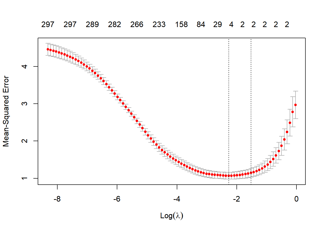
This plot has all the candidate \(\lambda\) values on the x-axis (plotted on the log scale) and the average mean squared error (MSE) on the y-axis. The red dots show the average MSE for each \(\lambda\) across the 5 folds. Recall that as \(\lambda\) gets very small we get closer to the standard squared error loss. The numbers at the top of the figure shows the number of features with non-zero weight included in the model for each \(\lambda\) value. Note that as \(\lambda\) gets smaller we get more and more features included and in the limit we get all of the 300 features (like we do with non-penalized least squares). As \(\lambda\) gets bigger we get a more parsimonious model with a smaller set of features. In this example it looks like we minimize MSE around -2 on the log scale. The \(\lambda\) with the smallest MSE is returned automatically in the lmLASSO object:
lmLASSO$lambda.min[1] 0.1035549Ok - now we make predictions using this \(\lambda\) value:
yPredictLasso = predict(lmLASSO,newx = xVal,s=lmLASSO$lambda.min)[,1]
rmseLasso <- sqrt(mean((yVal - yPredictLasso)**2))
We can now compare the two models:
rmseLM[1] 1.542535rmseLasso[1] 0.9712141We see about a 33% reduction in prediction error (measured as RMSE) by going with the LASSO. You can see why this happens in the plot above: the LASSO (at the optimal \(\lambda\) value) drops almost all features except the two that really matters! In doing this, the LASSO is able to avoid all the noise that comes from training all those irrelevant feature weights.
Case Study: Tractors in Colorado
Let’s go back to the tractor price case. Suppose we were interested only in predicting prices in the state of Colorado.
import pandas as pd
from sklearn.linear_model import LinearRegression
from sklearn.linear_model import Lasso
from sklearn.linear_model import LassoCV
import numpy as np
from sklearn.metrics import mean_squared_error
import seaborn as sns
import matplotlib.pyplot as plt


df = pd.read_csv('data/colorado.csv')

Xdf = df[['salemonth','fiSecondaryDesc','MachineAgeCat','Enclosure','Ripper','Travel_Controls','Transmission','Blade_Type']].copy()
X = pd.get_dummies(data=Xdf, drop_first=True)


X_train = X[df.data == 'train']
X_test = X[df.data == 'test']
y_train = np.log(df.SalePrice[df.data == 'train'])
y_test = np.log(df.SalePrice[df.data == 'test'])
The data only has 166 tractor prices in Colorado. This is a case where overfitting can be a real problem. Let’s try to train both a linear model and a linear model with a LASSO penalty to the training data (which he has 100 tractors) and see how we do on the 11 tractors in the test data.
First we train the linear model:
model = LinearRegression()
model.fit(X_train,y_train)
LinearRegression()In a Jupyter environment, please rerun this cell to show the HTML representation or trust the notebook.
On GitHub, the HTML representation is unable to render, please try loading this page with nbviewer.org.
LinearRegression()
y_predictLM = model.predict(X_test)
rmseLM = np.sqrt(mean_squared_error(np.exp(y_test), np.exp(y_predictLM)))
rmseLM16264.20600475699Next we set up the LASSO and do cross-validation (using only 3 folds due to the very small sample size):
nFolds = 3
model = LassoCV(cv = nFolds)
model.fit(X_train,y_train)

# get average MSE across the foldsLassoCV(cv=3)In a Jupyter environment, please rerun this cell to show the HTML representation or trust the notebook.
On GitHub, the HTML representation is unable to render, please try loading this page with nbviewer.org.
LassoCV(cv=3)
avgMSE = model.mse_path_.mean(axis=-1)

# plot
pl = sns.lineplot(x=np.log(model.alphas_), y = avgMSE)
pl.set(title='Cross Validation Results', xlabel = 'alpha', ylabel = 'MSE')
plt.show()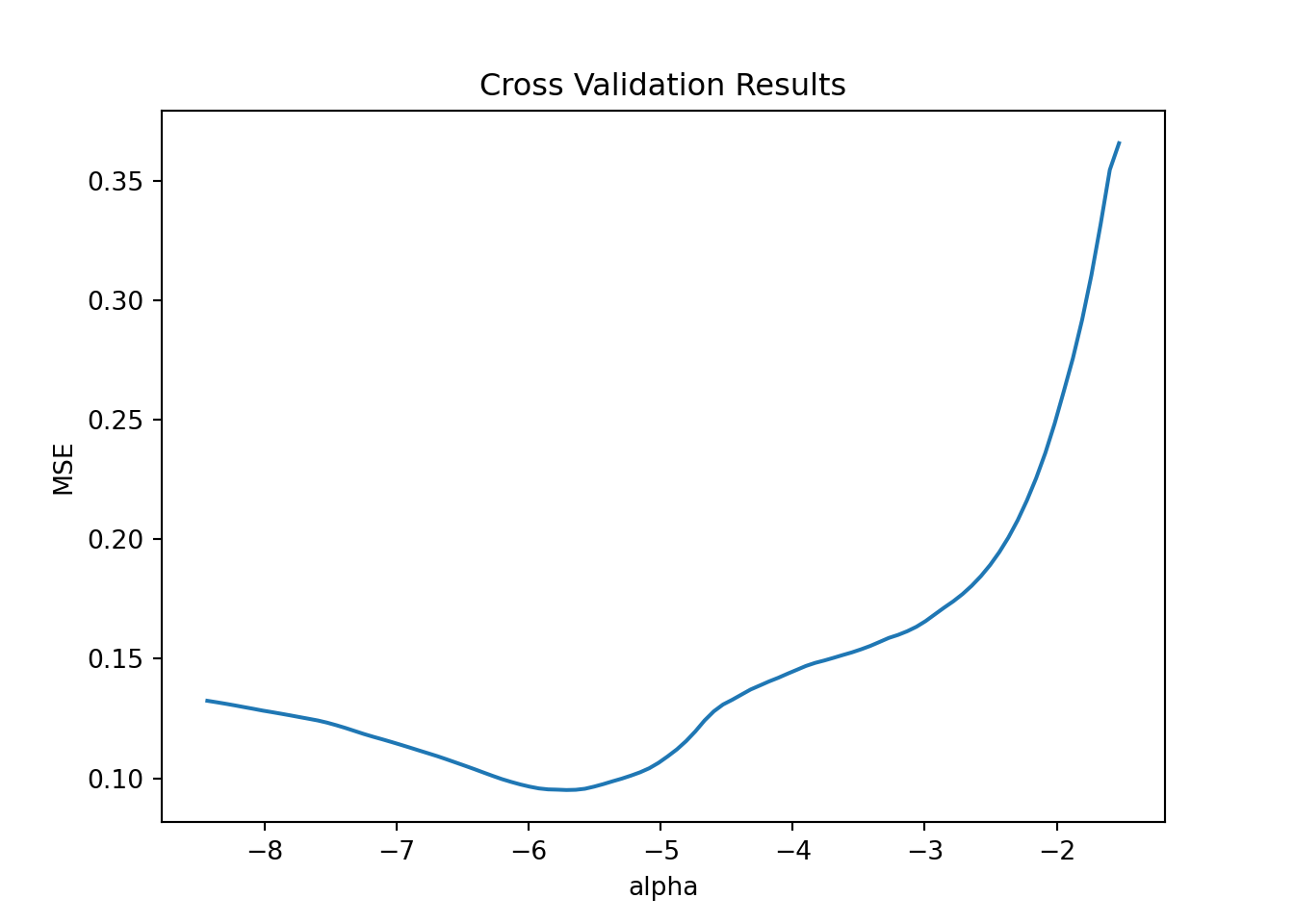
We pick the optimal \(\lambda\) value and train the model with that and form predicions:
model = Lasso(alpha=model.alpha_)
model.fit(X_train,y_train)Lasso(alpha=0.0032979761482545607)In a Jupyter environment, please rerun this cell to show the HTML representation or trust the notebook.
On GitHub, the HTML representation is unable to render, please try loading this page with nbviewer.org.
Lasso(alpha=0.0032979761482545607)
y_predictLASSO = model.predict(X_test)
rmseLASSO = np.sqrt(mean_squared_error(np.exp(y_test), np.exp(y_predictLASSO)))
rmseLASSO14888.599017194338We see a (small) improvement over the linear model in this case.
library(tidyverse)
library(glmnet)

df <- read_csv('data/colorado.csv')
The data only has 166 tractor prices in Colorado. This is a case where overfitting can be a real problem. Let’s try to train both a linear model and a linear model with a LASSO penalty to the training data (which he has 100 tractors) and see how we do on the 11 tractors in the test data.
First we train the linear model:
## linear model
lmF <- log(SalePrice)~ salemonth + fiSecondaryDesc  +
  MachineAgeCat + Enclosure + Ripper + Travel_Controls + Transmission + Blade_Type

lmNP <- lm(lmF,data = filter(df, data=='train'))
Next we set up the data for LASSO penalty:
## linear model with L1 penalty (LASSO)
mm <- model.matrix(lmF,df)                   # creates X matrix of the model lmF
mmT <- mm[which(df$data=='train'),2:ncol(mm)]
yT <- log(df$SalePrice[which(df$data=='train')])

mmTest <- mm[which(df$data=='test'),2:ncol(mm)]
yTest <- log(df$SalePrice[which(df$data=='test')])
Due to the very low sample size we use 3-fold cross-validation to pick \(\lambda\)::
## cross validation
lmLASSO = cv.glmnet(mmT, yT, nfolds=3, alpha=1.0)
## plot results
plot(lmLASSO)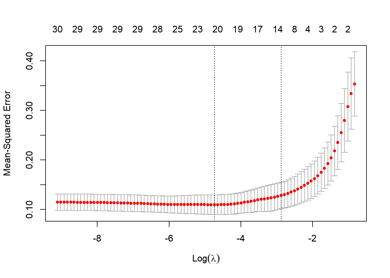
We appear to get the best performance for a lambda weight of 0.0087475. So let’s go with that to get predictions and compare to the linear model:
predictLM <- predict(lmNP,newdata = filter(df, data=='test'))
predictLASSO <- predict(lmLASSO,newx = mmTest,s=lmLASSO$lambda.min)

rmseLM <- sqrt(mean((exp(yTest) - exp(predictLM))^2))
rmseLASSO <- sqrt(mean((exp(yTest) - exp(predictLASSO))^2))

rmseLM
[1] 16264.21rmseLASSO[1] 15309We clearly see the improved predictive performance of the LASSO compared to the unpenalized model. Finally, we can see which features the model actually retained:
coef(lmLASSO,s = lmLASSO$lambda.min)31 x 1 sparse Matrix of class "dgCMatrix"
s1
(Intercept) 10.687771342
salemonthAug -0.077531128
salemonthDec 0.187794681
salemonthJun .
salemonthMar -0.061911341
salemonthNov -0.001657195
salemonthOct -0.111694602
salemonthSep 0.056616842
fiSecondaryDescD 0.359841386
fiSecondaryDescH 0.721686296
fiSecondaryDescM 0.042228660
fiSecondaryDescN .
fiSecondaryDescR 0.661293124
MachineAgeCat>15 -0.492531028
MachineAgeCat11-15 -0.232314745
MachineAgeCat3-4 0.243561380
MachineAgeCat5-6 0.053510070
MachineAgeCat7-10 .
EnclosureEROPS w AC .
EnclosureOROPS -0.042503033
RipperNone or Unspecified -0.128214695
RipperSingle Shank -0.007243331
Travel_ControlsFinger Tip .
Travel_ControlsNone or Unspecified .
TransmissionStandard -0.169180480
Blade_TypeNone or Unspecified .
Blade_TypePAT 0.232193764
Blade_TypeSemi U .
Blade_TypeStraight -0.063836198
Blade_TypeU 0.040736247
Blade_TypeVPAT 0.468430218