library(leaflet)
library(tidyverse)
citibike <- read_rds('data/201508.rds')
## summarize data to plot
station.info <- citibike %>%
group_by(start.station.id) %>%
summarise(lat=as.numeric(start.station.latitude[1]),
long=as.numeric(start.station.longitude[1]),
name=start.station.name[1],
n.trips=n())
## make plot with station locations
leaflet(station.info) %>%
addTiles() %>%
addCircles(lng = ~long, lat = ~lat)Interactive Maps and Dynamic Visualizations
Cool interactive maps can be created using the leaflet package. It is pretty straightforward:
When you plot this in Rstudio you can zoom in and out of the plot (too see what it looks like click on the map above). At a later module we will look at how to intergrate interactive maps into web-pages and html presentations.
You often want to add information to the markers in the maps. Again easy:
library(dplyr)
station.info <- citibike %>%
group_by(start.station.id) %>%
summarise(lat=as.numeric(start.station.latitude[1]),
long=as.numeric(start.station.longitude[1]),
n.trips=n(),
name=paste0(start.station.name[1],'<br/>','Number of Trips: ',n.trips))
leaflet(station.info) %>%
addTiles() %>%
addCircles(lng = ~long, lat = ~lat, popup = ~name) %>%
addProviderTiles("OpenStreetMap.Mapnik")You can add further information and use an html break where you want line breaks:
station.info <- citibike %>%
group_by(start.station.id) %>%
summarise(lat=as.numeric(start.station.latitude[1]),
long=as.numeric(start.station.longitude[1]),
n.trips.subscriber=sum(usertype=='Subscriber'),
n.trips.customer=sum(usertype=='Customer'),
n.trips = n(),
name=paste0(start.station.name[1],'<br/>',
'Number of Customer Trips: ',n.trips.customer,'<br/>',
'Number of Subscriber Trips: ',n.trips.subscriber))
leaflet(station.info) %>%
addTiles() %>%
addCircles(lng = ~long, lat = ~lat, popup = ~name) %>%
addProviderTiles("OpenStreetMap.Mapnik")Here is a version with less clutter and circle size conveying information (here number of trips):
leaflet(station.info) %>%
addTiles() %>%
addCircles(lng = ~long,
lat = ~lat,
weight = 1,
radius = ~sqrt(n.trips)*2,
popup = ~name) %>%
addProviderTiles(providers$Esri.WorldGrayCanvas)Making an interactive choropleth with Leaflet
Here we will construct an interactive choropleth using Leaflet. You may not have heard the word “choropleth” before but you have almost certainly seen one. It is those maps where different areas are shaded or colored depending on the value of some underlying measure. In the following we will use the data for all taxi trips in Chicago in September 2019. The source of the data is here. We start by reading in the data and perform a few transformations, e.g., converting dates to day of week and getting hour of day from time stamps:
library(tidyverse)
library(leaflet)
library(maptools)
library(rgdal)
library(lubridate)
library(viridis)
## read data
trips <- read_rds('data/taxiTrips19_09.rds') %>%
mutate(weekDayStart = weekdays(`Trip Start Timestamp`),
weekDayEnd = weekdays(`Trip End Timestamp`),
hourStart = hour(`Trip Start Timestamp`),
hourEnd = hour(`Trip End Timestamp`),
dateStart = as.Date(`Trip Start Timestamp`),
dateEnd = as.Date(`Trip End Timestamp`))We are going to construct a map where we can visualize trip pick-up and drop-off intensity for different areas of the city. To preserve privacy, the Chicago taxi data does not contain the exact latitude and longitude of trips. Instead we will look at trip locations at an aggregated level called “community areas”. These areas will define the boundaries of the different regions of the map.
To contruct the areas of a choropleth you need a shapefile. This is a data file - in a very specific format - that defines the boundaries for each area of a map. To create a choropleth, your first step is to locate the relevant shapefile. For example, if you want to create a choropleth of US counties you need to find a shapefile that defines these boundaries (you can find this online). The shapefile for the city of Chicago’s community areas can be downloaded here. THere are a number of different R packages that can work with shapefiles - here we will use the rgdal package that is designed for working with geospatial data.
To read a shapefile we use the readOGR function in the rgdal package which takes as argument the folder where the shapefile is. We then convert the shapefile into a special type of dataframe called a SpatialPolygonsDataFrame which contains the plot data we need for the outlines of the areas of the map. This is done using the spTransform function:
areas <- readOGR('data/Boundaries - Community Areas')
shp <- spTransform(areas, CRS("+proj=longlat +datum=WGS84"))OGR data source with driver: ESRI Shapefile
Source: "C:\Users\k4hansen\Dropbox\bap2023\modules\Visualization\data\Boundaries - Community Areas", layer: "geo_export_8483dd66-6422-40d4-8c42-a408c8575d21"
with 77 features
It has 9 fieldsThis is all we need to plot the outlines of the different areas of the map with Leaflet:
leaflet(shp) %>%
addTiles() %>%
setView(lat=41.891105, lng=-87.652480,zoom = 11) %>%
addProviderTiles(providers$CartoDB.Positron) %>%
addPolygons(data=shp,
weight=1,,
highlightOptions = highlightOptions(color = "white", weight = 2,bringToFront = TRUE)
)The highlightOptions option gives a map where you can hover your cursor to highlight different sections of the map. Ok - this map is not very interesting since we haven’t put any data on it. Let’s do that next.
To get some data, we count pick-ups and drop-offs at the different areas:
tripByArea <- trips %>%
select(`Pickup Community Area`,`Dropoff Community Area`) %>%
gather(variable,area_num_1) %>%
count(variable,area_num_1) %>%
drop_na(area_num_1) %>%
mutate(area_num_1 = as.character(area_num_1))We convert the area index area_num_1 to character since the same index is character type in the shp polygon dataframe. Next we define two spatial polygon dataframes - one for pick-ups and one for drop-offs. We then join in the relevant counts for each area:
shpPickUp <- shp
shpDropOff <- shp
shpPickUp@data <- shpPickUp@data %>%
left_join(filter(tripByArea,variable == 'Pickup Community Area'),
by = 'area_num_1')
shpDropOff@data <- shpDropOff@data %>%
left_join(filter(tripByArea,variable == 'Dropoff Community Area'),
by = 'area_num_1')Ok - now we just have to define the different count cut-off values for each color and a color range. We use the color range “viridis” from the viridis package:
bins <- c(0, 1000, 2500, 5000, 10000,15000,20000,25000,35000,50000,100000,400000)
pal <- colorBin("viridis", domain = shp@data$n, bins = bins)Next we define the information shown in the pop-up fields when a user click on the map. Here we go with the name of the area and the count of the area:
theLabelsPickUp <- sprintf(
"<strong>Area: %s</strong><br/>Count=%g",
shpPickUp@data$community, shpPickUp@data$n
) %>% lapply(htmltools::HTML)
theLabelsDropOff <- sprintf(
"<strong>Area: %s</strong><br/>Count=%g",
shpDropOff@data$community, shpDropOff@data$n
) %>% lapply(htmltools::HTML)Finally we are ready to product the map. We define a separate layer for pick-ups and drop-offs to the user can choose what the map displays:
leaflet(shpPickUp) %>%
addTiles() %>%
setView(lat=41.891105, lng=-87.652480,zoom = 11) %>%
addProviderTiles(providers$CartoDB.Positron) %>%
addPolygons(data=shpPickUp,
weight=1,
fillColor = ~pal(n),
fillOpacity = 0.6,
group = "Pick-Ups",
highlightOptions = highlightOptions(color = "white", weight = 2,
bringToFront = TRUE),
label=~theLabelsPickUp) %>%
addPolygons(data=shpDropOff,
weight=1,
fillColor = ~pal(n),
fillOpacity = 0.6,
group = "Drop-offs",
highlightOptions = highlightOptions(color = "white", weight = 2,
bringToFront = TRUE),
label=~theLabelsDropOff) %>%
addLegend(pal = pal,
values = ~n,
opacity = 0.6,
title = "Taxi Trips",
position = "topright") %>%
addLayersControl(
baseGroups = c("Pick-Ups", "Drop-offs"),
options = layersControlOptions(collapsed = FALSE)
) For full instructions, go to the leaflet manual.
Dynamic Visualizations
Sometimes you can add some extra impact to a visualization by making it dynamic. Here we will see how we can make ggplot visualizations dynamic by using the gganimate library.
In the following we will use a database on taxi trips from Chicago for September 2019. We read in the the data and make a few transformations:
library(tidyverse)
library(lubridate)
library(scales)
library(gganimate)
trips <- read_rds('data/taxiTrips19_09.rds') %>%
mutate(weekDayStart = weekdays(`Trip Start Timestamp`),
weekDayEnd = weekdays(`Trip End Timestamp`),
hourStart = hour(`Trip Start Timestamp`),
hourEnd = hour(`Trip End Timestamp`),
dateStart = as.Date(`Trip Start Timestamp`),
dateEnd = as.Date(`Trip End Timestamp`),
dayStart = day(dateStart))Ok - now we have some data. Suppose we wanted to show how the number of rides change throughout the hours of the day and day of the week. We could should this with a bar chart with a bar for each hour of the day and a chart for each day of the week. Here we will try a different angle: We will “wrap” the counts around a clock to highlight the hours of the day feature and then we animate the clock to illustrate changes for each day of the week. We start by counting trips for each day of the week and each hour of the day and then define a dateframe that allows us to plot both AM and PM on the same clock face:
hourCounts <- trips %>%
count(dayStart,hourStart)
timeDF <- data.frame(
time1 = c(0:23),
time2 = c(c(12,1:11),c(12,1:11)),
AmPm = c(rep("Am",12),rep("Pm",12))
)Next we create the base plot that will be animated:
pl1 <- hourCounts %>%
left_join(timeDF,by=c('hourStart'='time1')) %>%
ggplot(aes(x=factor(time2),y=n,fill=AmPm)) +
geom_bar(stat='identity',position = 'dodge') +
scale_y_continuous(labels=comma)+
labs(title = 'Number of Taxi Trips by Hour of Day',
subtitle = 'Chicago, September 2019',
x = 'Hour of Day',
y = 'Number of Trips') +
coord_polar(start=.25)Ok - all we have to do now is that inform R what variable represents “time”, i.e., what variable changes dynamically in the plot. In this case this is dayStart. Finally, we call animate which will create the animated plot:
pl1 <- pl1 + transition_time(dayStart) +
labs(title = "Day of Month: {frame_time}")
animate(pl1)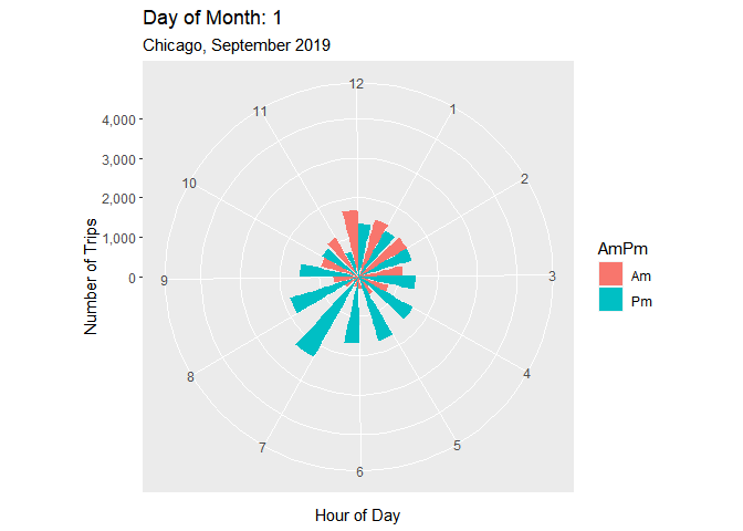
Animated Line Chart
Suppose we wanted instead to look at how trip counts changed across different areas of Chicago throughout the day. To do this we first count trips for each area and hour of the day. We will focus on the top 12 areas in terms of trips so we extract the identify of the top 12 also:
hourCounts <- trips %>%
count(`Pickup Community Area`,hourStart)
areaCounts <- hourCounts %>%
drop_na(`Pickup Community Area`) %>%
group_by(`Pickup Community Area`) %>%
summarize(total = sum(n)) %>%
top_n(12,wt = total)Here we are going to use a line chart which reveals counts dynamically throughout the day (this is done using the transition_reveal function):
pl1 <- hourCounts %>%
filter(`Pickup Community Area` %in% areaCounts$`Pickup Community Area`) %>%
mutate(`Pickup Community Area` = factor(`Pickup Community Area`)) %>%
ggplot(aes(x = hourStart, y = n, color = `Pickup Community Area`)) + geom_point() + geom_line() +
facet_wrap(~`Pickup Community Area`) +
theme(legend.position = 'none') +
labs(title = 'Taxi Pick-ups By Community Area and Time of Day',
y = 'Pickup Counts',
x = 'Time of Day',
subtitle = 'Top 12 Areas')
pl1 <- pl1 + transition_reveal(hourStart)
animate(pl1)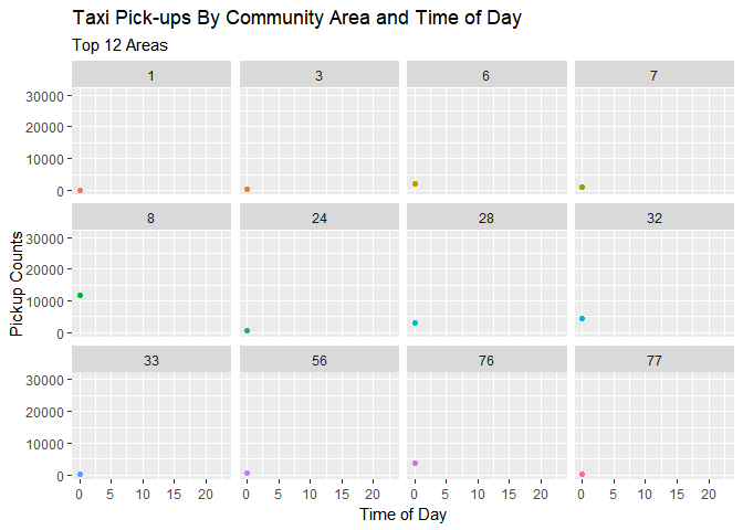
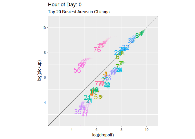
Animated Scatter Plot
Finally we will use a scatter plot with pick-up and drop-off counts and animate it using a third background variable (hour of the day). We first calculate pick-up and drop-off counts for each area and then find the top 20 areas overall:
hourCountsPickup <- trips %>%
count(`Pickup Community Area`,hourStart,name = 'pickup') %>%
rename(area = `Pickup Community Area`,
hour = hourStart)
hourCountsArea <- trips %>%
count(`Dropoff Community Area`,hourEnd,name = 'dropoff') %>%
rename(area = `Dropoff Community Area`,
hour = hourEnd) %>%
inner_join(hourCountsPickup, by = c('area','hour')) %>%
mutate(total = dropoff + pickup)
topAreas <- hourCountsArea %>%
drop_na(area) %>%
group_by(area) %>%
summarize(total = sum(total)) %>%
top_n(20,wt=total)Next we create the plot and animation - here using the option shadow_wake which creates a trail of each point. We also slow down the animation to 5 frames per second (the default is 10):
pl1 <- hourCountsArea %>%
filter(area %in% topAreas$area) %>%
mutate(areaString = as.character(area),
areaF = factor(area)) %>%
ggplot(aes(x = log(dropoff),y = log(pickup), color = areaF)) + geom_text(aes(label = areaString), size = 6) +
geom_abline(aes(slope=1,intercept=0)) + coord_fixed(xlim = c(2.5,10.5),ylim = c(2.5,10.5)) +
labs(title = 'Pick-ups and Drop-offs By Hour of Day', subtitle = 'Top 20 Busiest Areas in Chicago') +
theme(legend.position = 'none')
pl1Anim <- pl1 + transition_time(hour) +
shadow_wake(wake_length = 0.25, alpha = TRUE) +
labs(title = "Hour of Day: {frame_time}")
animate(pl1Anim, fps=5)